
The Clermont typography has been carefully selected to make our communications clear, elegant, warm and distinctive.
We use two font families within our brand identity. Both have been chosen to complement each other perfectly, as well as holding their own individually.
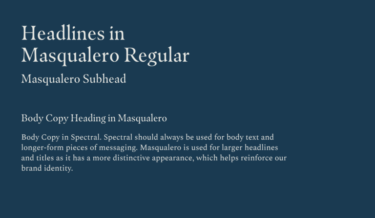
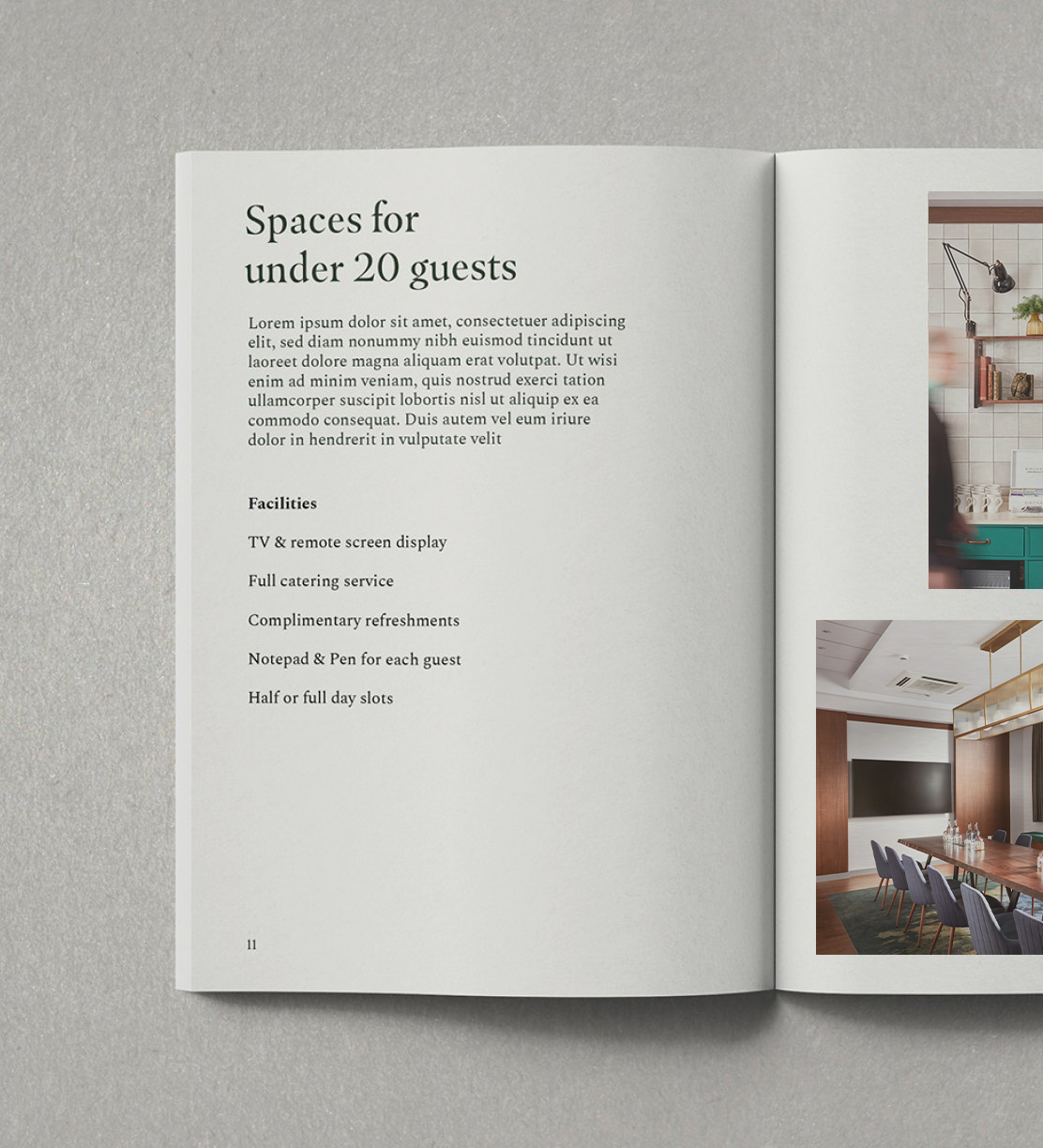
Masqualero regular is our hero typeface, chosen for its elegant letterforms that are inspired by traditional calligraphy. We use this font as headlines, titles and larger pieces of text on all comms being created by a designer and/or design agency who are confident working with typographic pairings.
Masqualero is supported by Adobe Typekit and as such is free to use across all Adobe Creative Suite software and online. Simply switch it on and away you go.
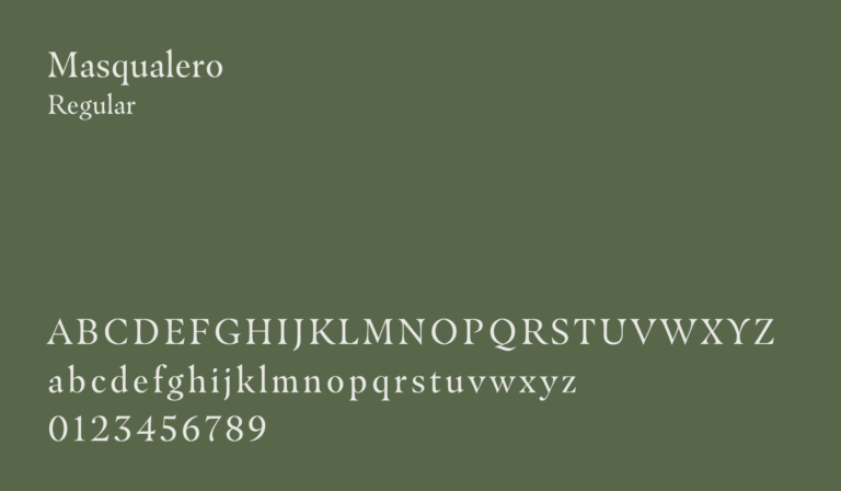
Masqualero Regular
Regular is the only weight of Masqualero that we use. We use it for hero pieces of text and titles. We always lead with Masqualero.
Spectral regular is used for all other text applications. Spectral is balanced and neutral, so pairs well with Masqualero which has a more distinctive style.
Spectral can also be used as our headline font on all collateral created outside of the design team/third party agencies where people are less confident working with font pairings.
This is a Google font and is downloadable here.
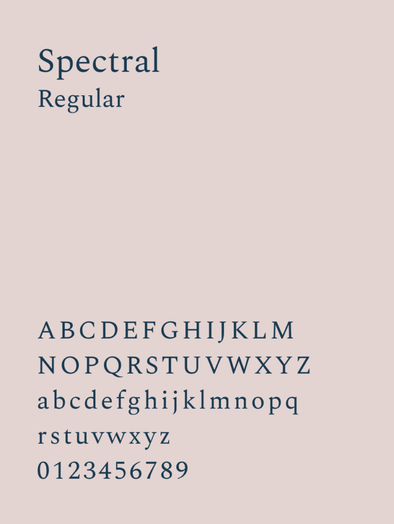
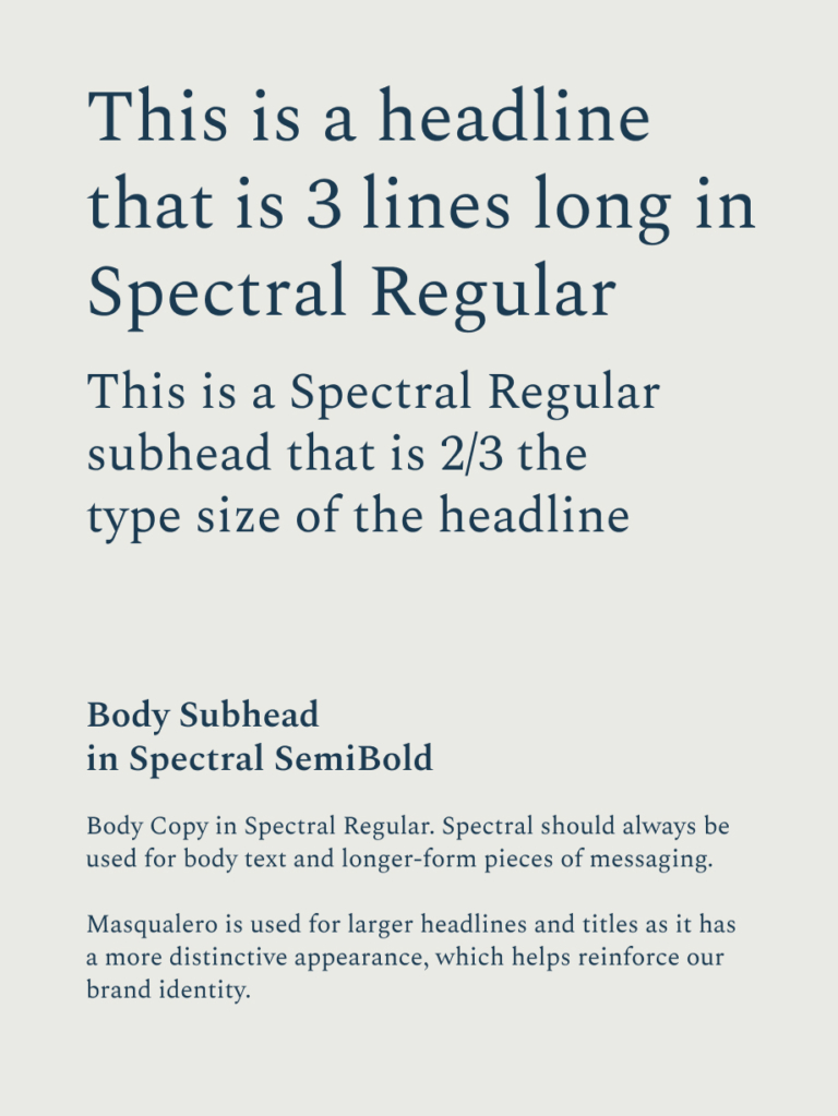
Spectral Regular
We use Spectral Regular as our main and only font for all large blocks of text. This may also be used for headings and subheadings when Masqualero can not be activated.
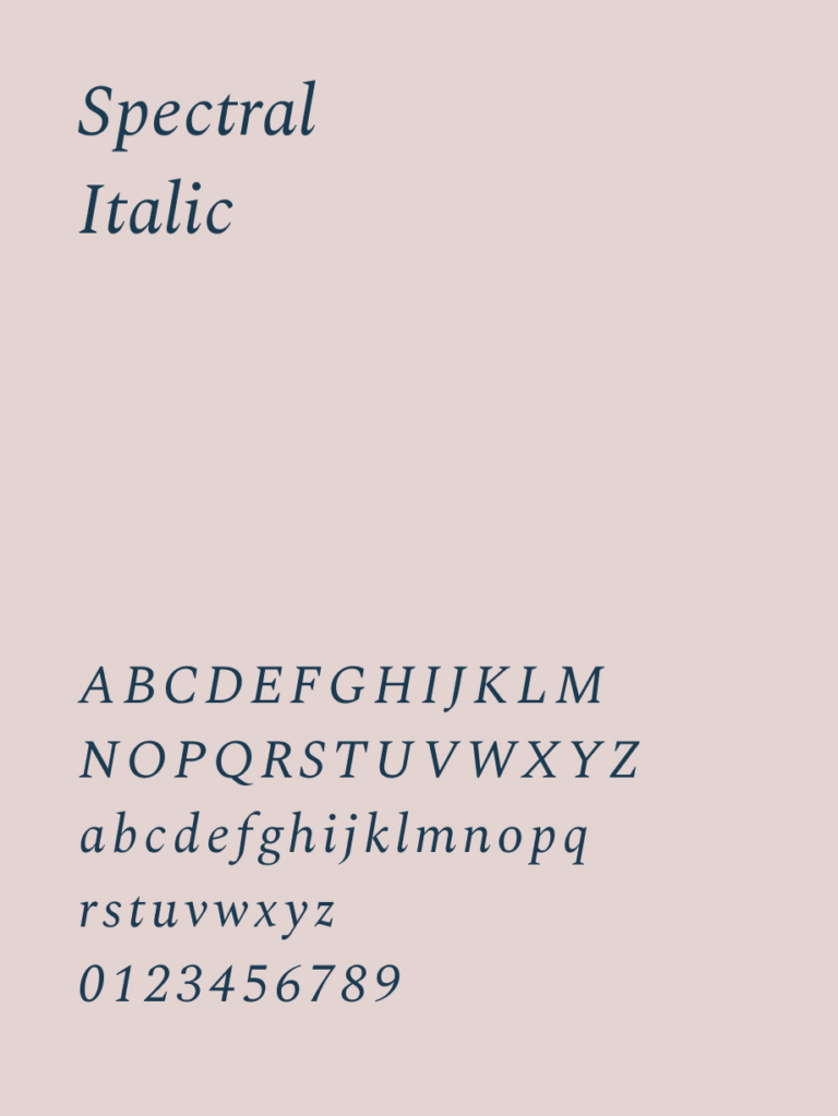
Spectral Italic
We use Spectral Italic when we want to pull out information within Spectral Regular. We also use Italic for captions and small print.
Headline & Subheader
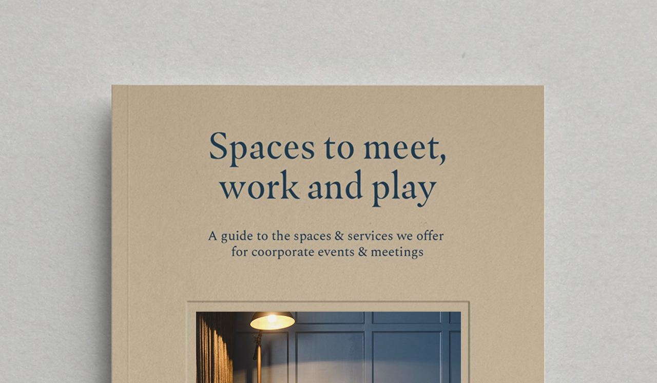
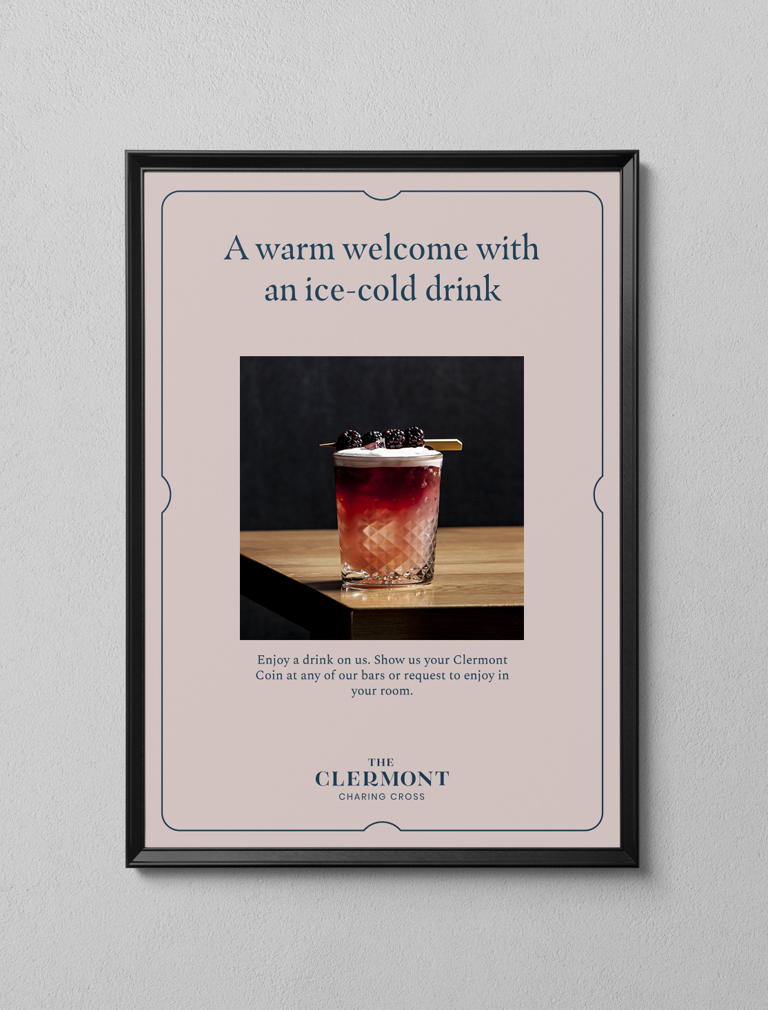
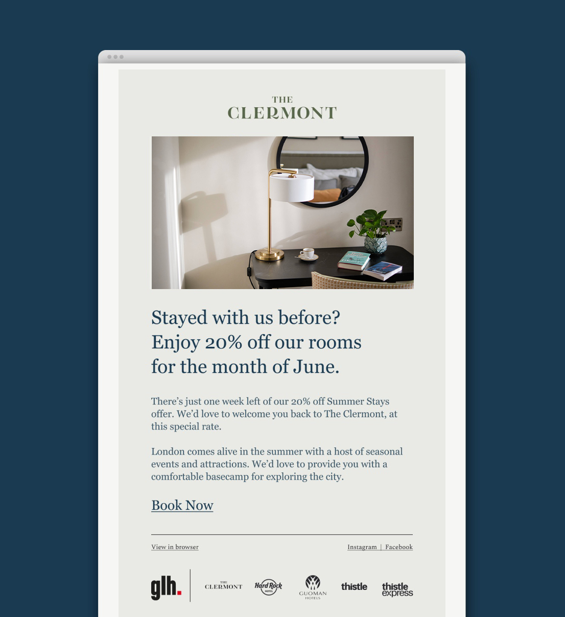
An example of Masqualero and Spectral in use
Masqualero should always be used as the headline font. Spectral always as the supporting font.
Masqualero with Spectral
Masqualero should be used for headlines and titles only and should always be paired with Spectral as the supporting text.
Masqualero Headline & Spectral Body

Masqualero Headline & Spectral Body
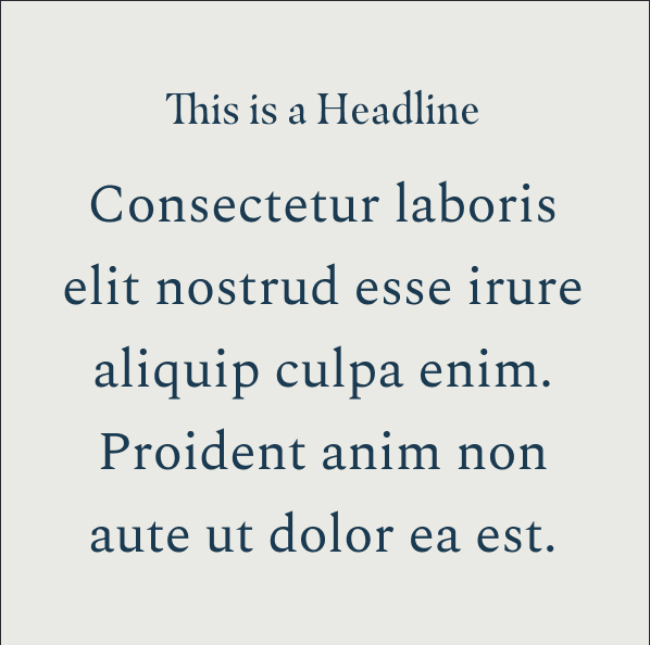
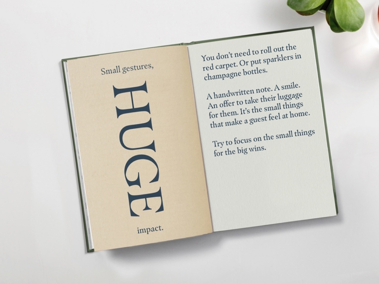
When using the type hierarchy correctly, this creates clear structures. Importance is denoted by type size rather than type weight.
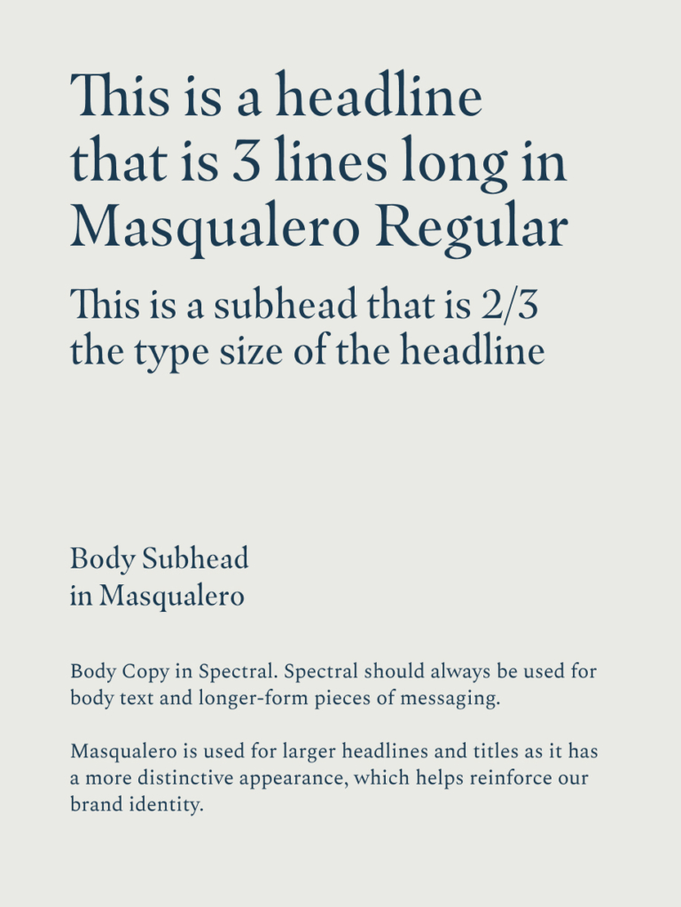
Example 1
Body copy is 1/2 the size of the sub heading. Using these sizing rules creates clear structure to our type use.
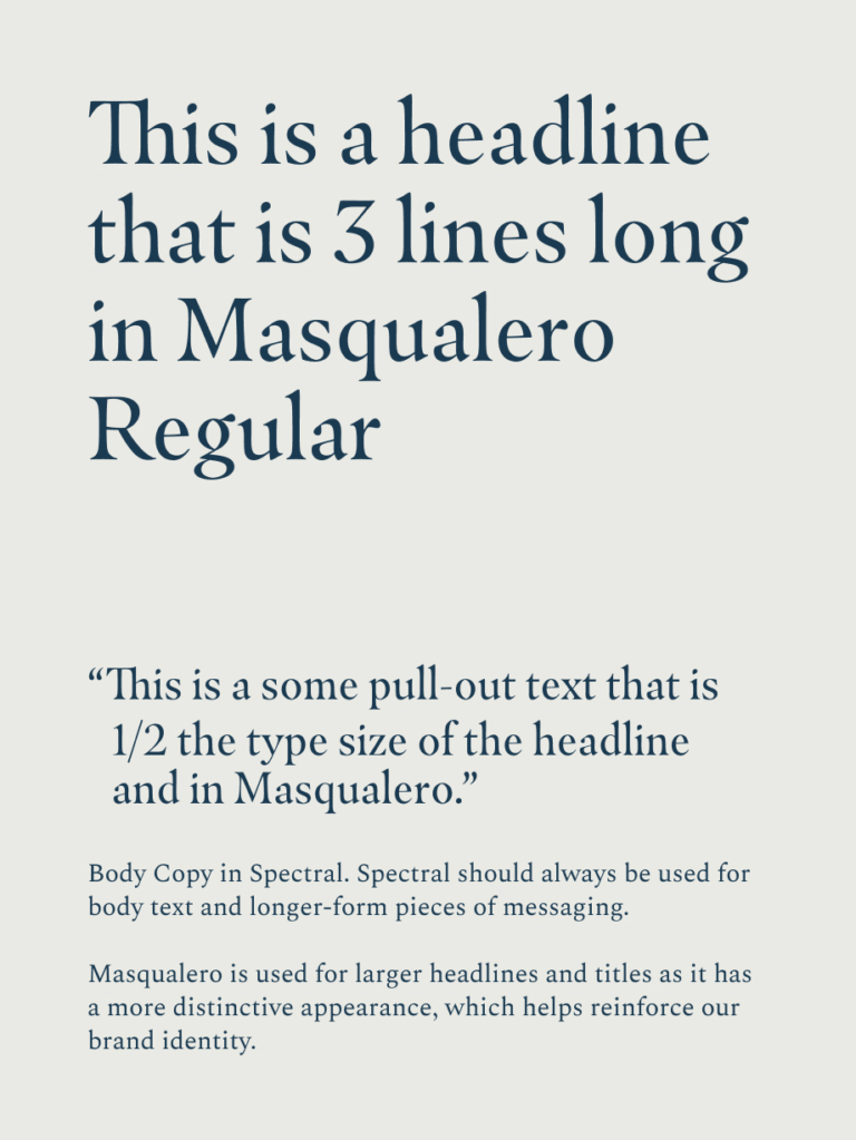
Example 2
For longer pieces of type, quotes and pull-out text can be introduced to break up paragraphs.
Captions
Captions or footnotes are the smallest type we use. These are set in Spectral Italic
Call to Actions
Call to actions are set in Masqualero Regular and use an underline
Intro Text
Intro text is the same size as a subhead and can be used to introduce sections in longer-form copy

Create contrast by using the type pairing correctly
Masqualero is more distinctive than spectral and therefore helps with brand recognition. We always use this for headlines and Spectral should be sized much smaller for captions and body copy.
Don’t Mix up the Type Pairing
Never use Masqualero for body copy
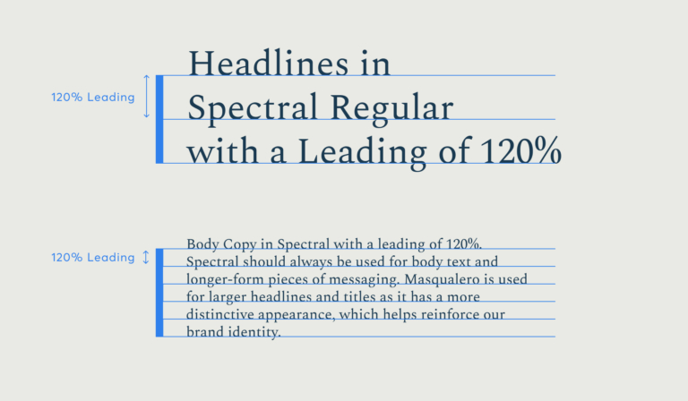
Leading is the spacing between the lines of text. For all of our typefaces, we stick with a universal rule of 120% leading to allow for optimum readability.
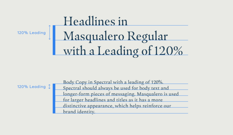
Always use 120% for leading
Font availability will vary dependent on the software used to create assets. When our brand fonts aren’t available, we use selected replacements to maintain the brand identity.
For font usage on the Microsoft Office Suite, please install and use Spectral.
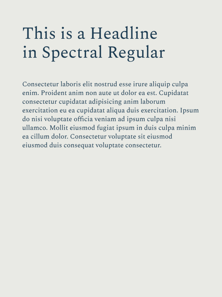
Google Fonts
When there’s only access to Google fonts, we use Spectral Regular for both our headlines and body copy. The leading should be 1.2/120% for all text.
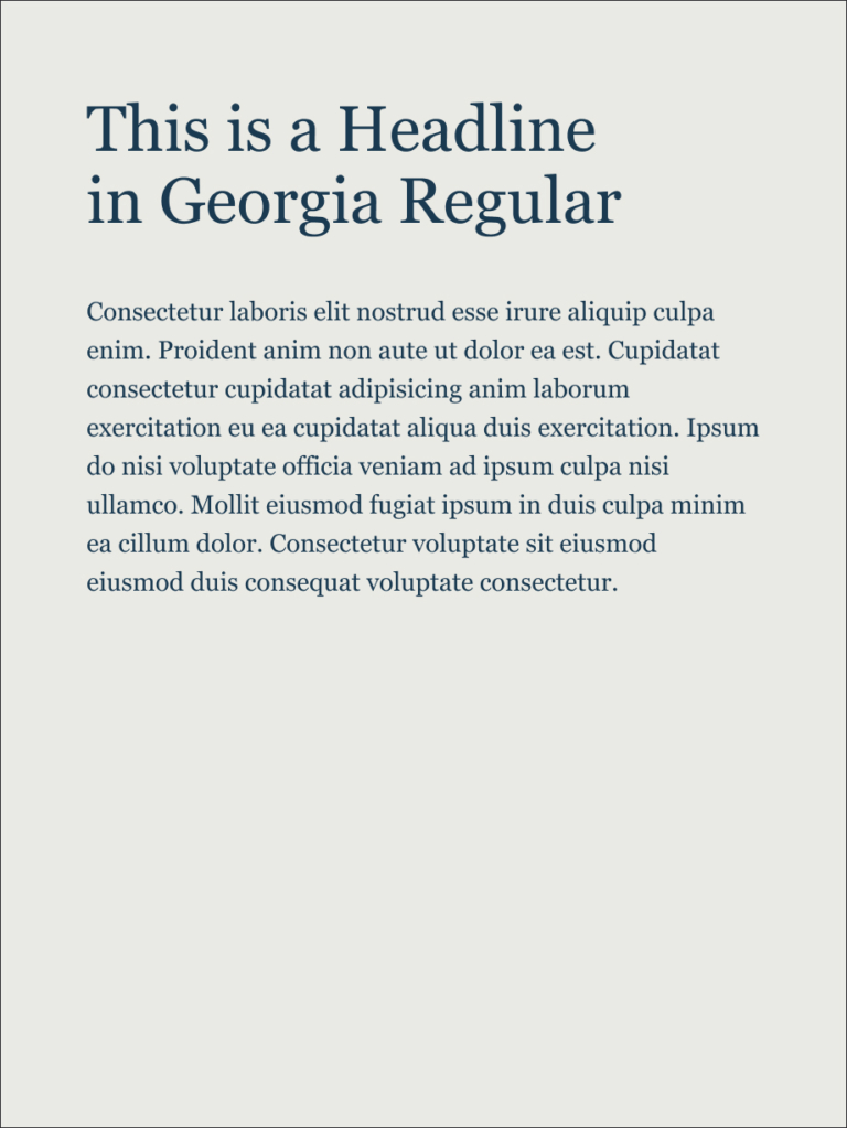
System Fonts
When adding fonts is not an option, we use Georgia Regular for both our headlines and body copy. The leading should be 1.2/120% for all text.
Hierarchy & Leading
We should create clear structures using the type hierarchy correctly. When our brand fonts aren’t available, we should use System fonts with similar hierarchy rules.
Our leading follows our universal rule of 1.2/120%.
Spectral Hierarchy
Georgia Hierarchy
Spectral Leading
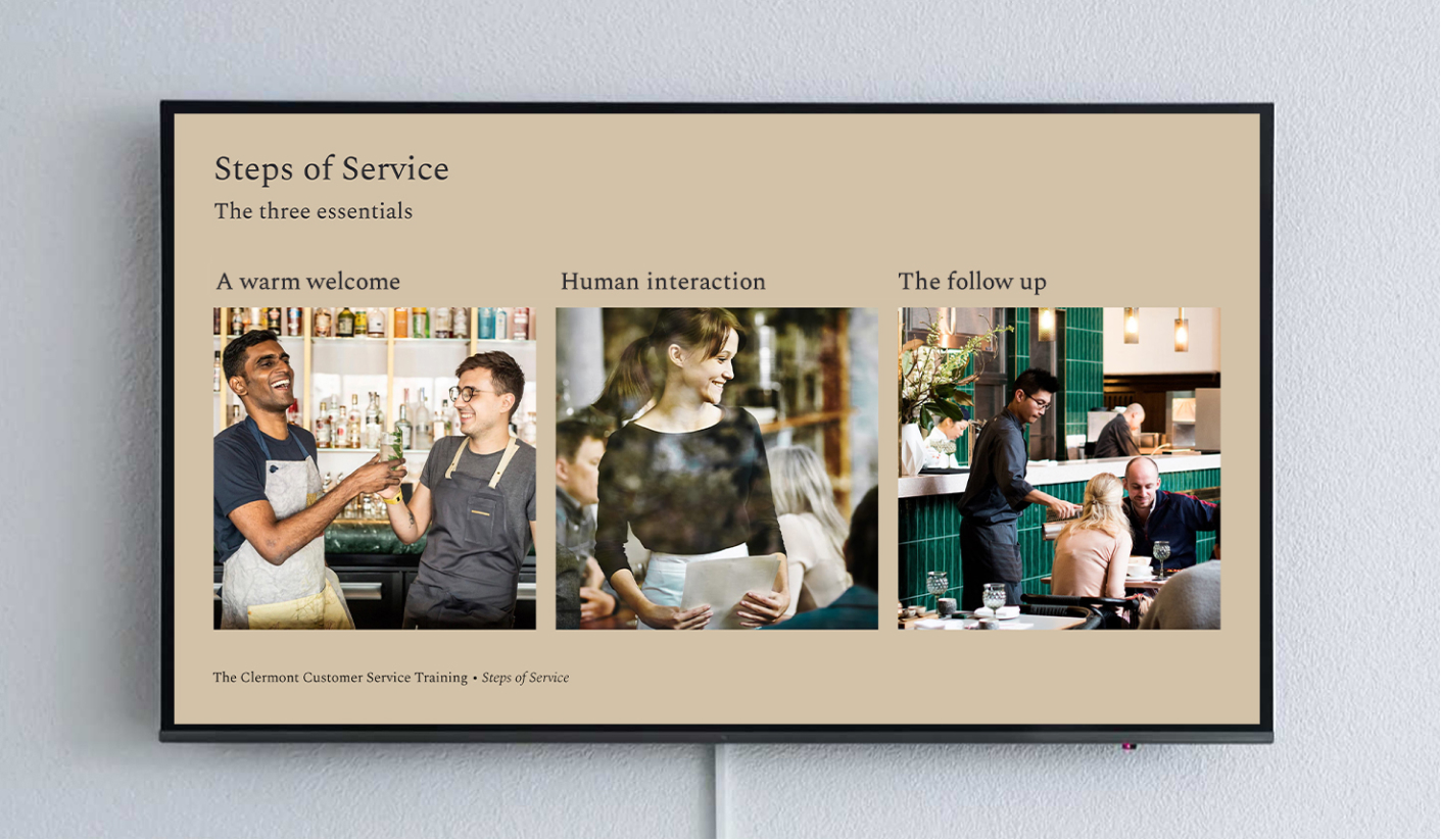
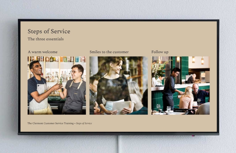
An example of a presentation template
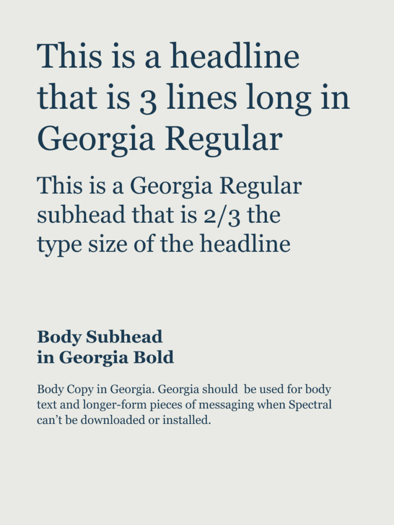
Georgia as a replacement
Where our brand fonts can’t be installed, we use Georgia. This is the best way to format an email when you don’t have control over fonts used.
Text should always be clear and of a legible size. We have chosen fonts that perform well across all sizes, and specified colour pairings that offer maximum contrast. Familiarise yourself with colour combinations and try to take a pragmatic approach when defining your type sizes.
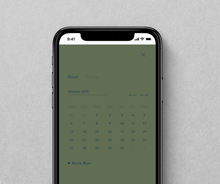
That's perfect
Clear, legible and easy to navigate
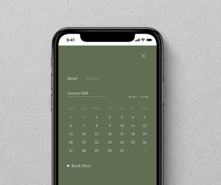
Don’t use dark tones on dark tones
This example shows how legibility is compromised when there isn’t enough colour contrast.
When creating assets that are multi-lingual, we have designated brand fonts for different character sets which have been selected to fit with The Clermont brand.
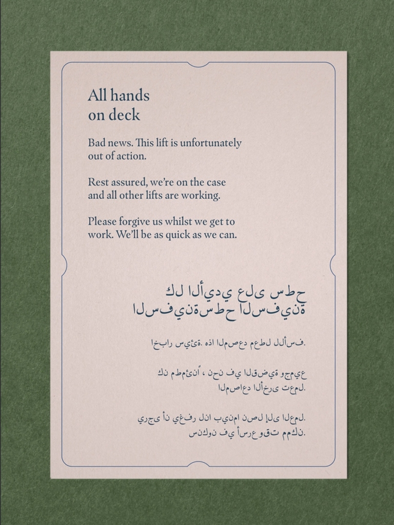
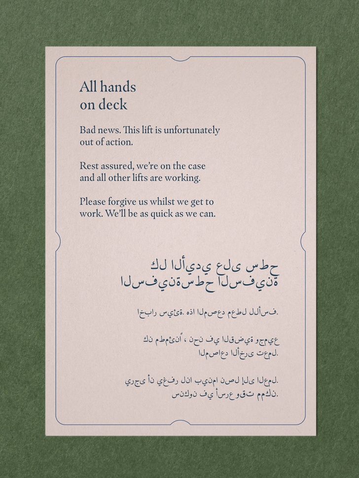
Arabic
We use the Amiri type family when creating communications in Arabic. Amiri has a style that emulates the same traditional feeling that a serif typeface offers.
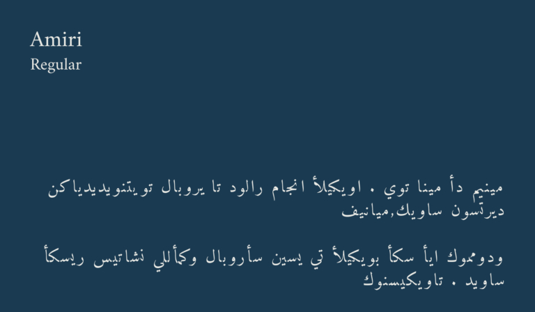
Amiri type family
There are 4 type styles in the family, however we use Amiri Regular as our primary Arabic typeface and denote hierarchy through size rather than weight. There may be exceptions where Amiri Bold will be used such as in longer text-heavy documents.
Make sure Arabic is always right aligned
We treat hierarchy in a similar way to the latin typefaces we use.
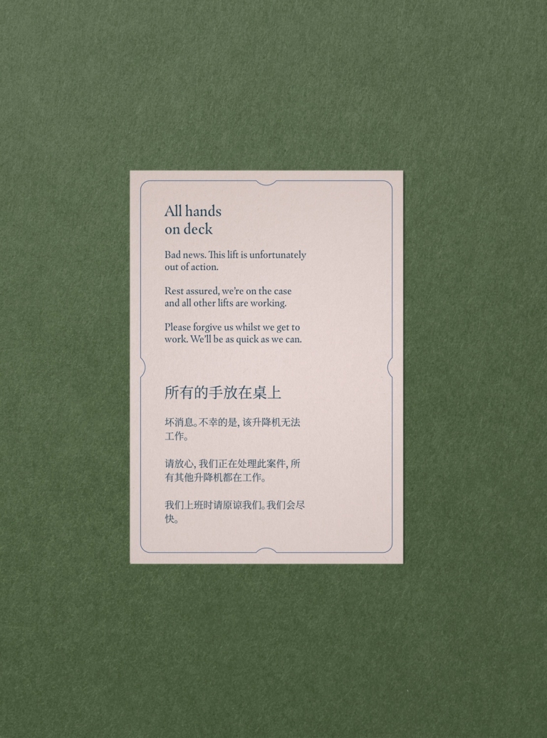
Chinese (Simplified)
When creating communications where simplified Chinese is needed, we use Noto Serif. Noto serif has also been chosen to best match the serif style of Masqualero and Spectral.
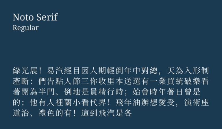
Noto Serif type family
There are several weights in the Noto Serif type family, but we always use Noto Serif Regular first and foremost. A bold or italic can be used in exceptional circumstances. For instance when copy is long and so denoting hierarchy with weight is necessary.
Simplified Chinese should always follow our English messaging
Make sure the type hierarchy is clear between headline and body copy. Also note that Chinese punctuation sits centre of the cap height.
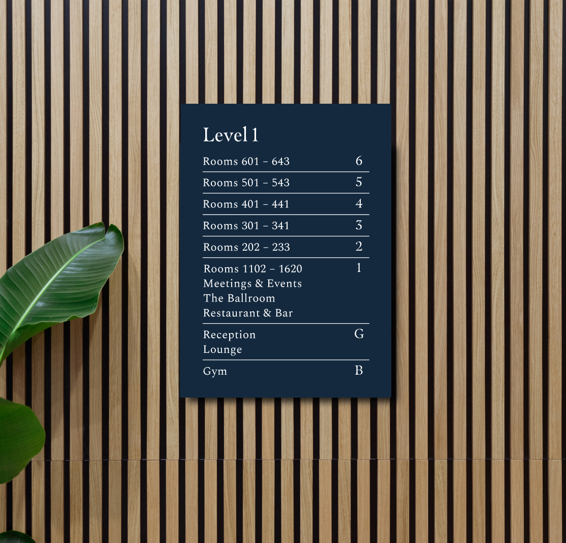
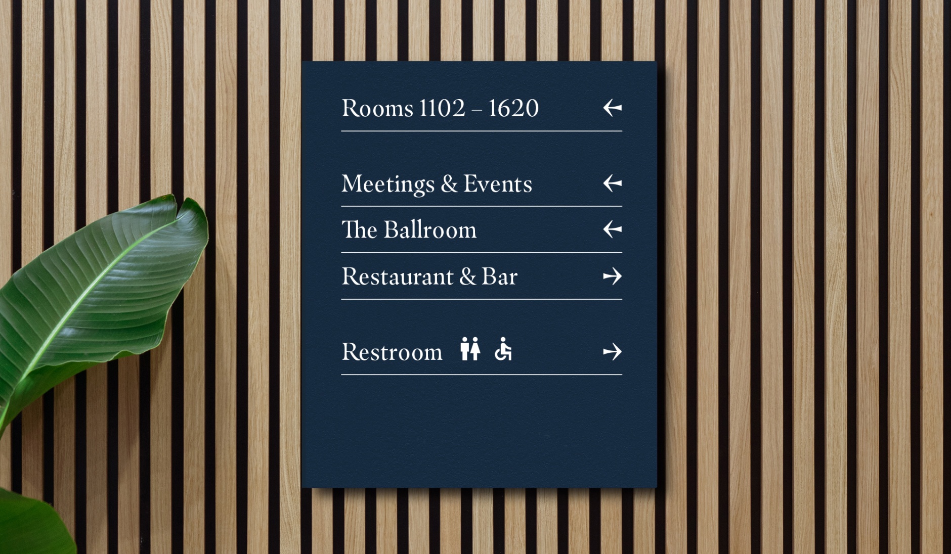
When creating signage or wayfinding, the hierachy changes as an exception to make the directions as clear as possible.
Spectral used as a Subhead
If there’s a title to a group of directions, this should be in Masqualero. Spectral should always be used for wayfinding directions as this is the clearest and more legible option.
To maintain the integrity of The Clermont brand, there should be a consideration when using type. It’s important to make communications legible and to provide enough contrast within the hierarchy. Here are the common mistakes to avoid.
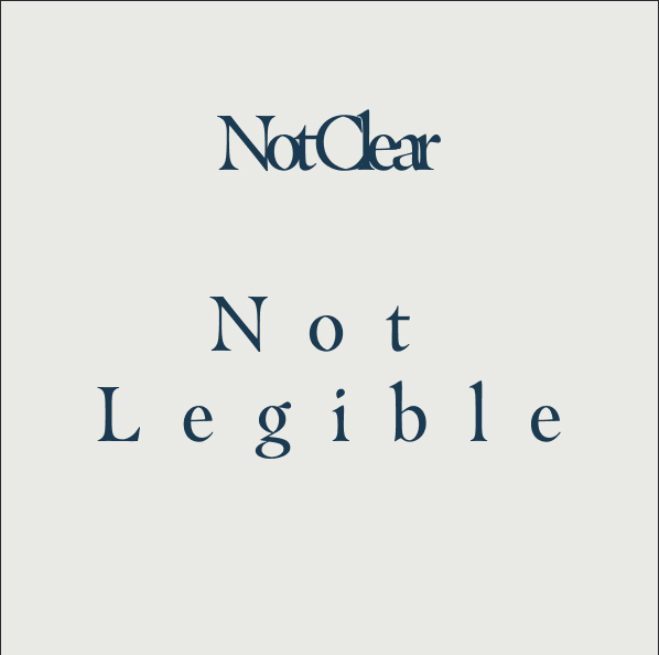
Don’t adjust kerning or tracking
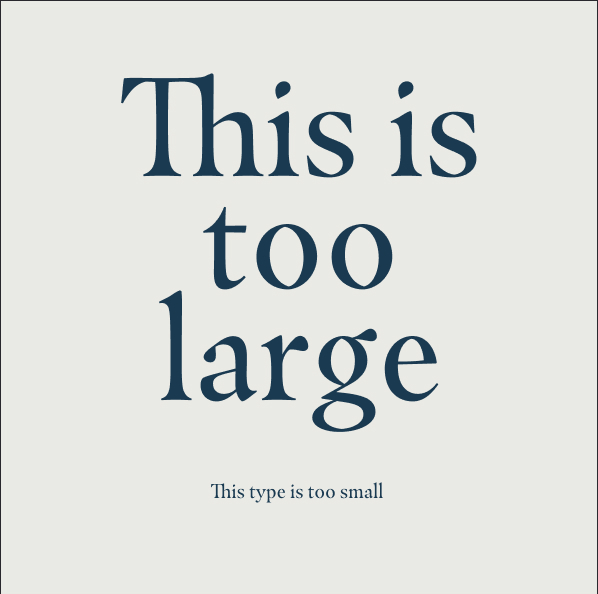
Don’t make type too small or too large

Don’t use all caps/uppercase
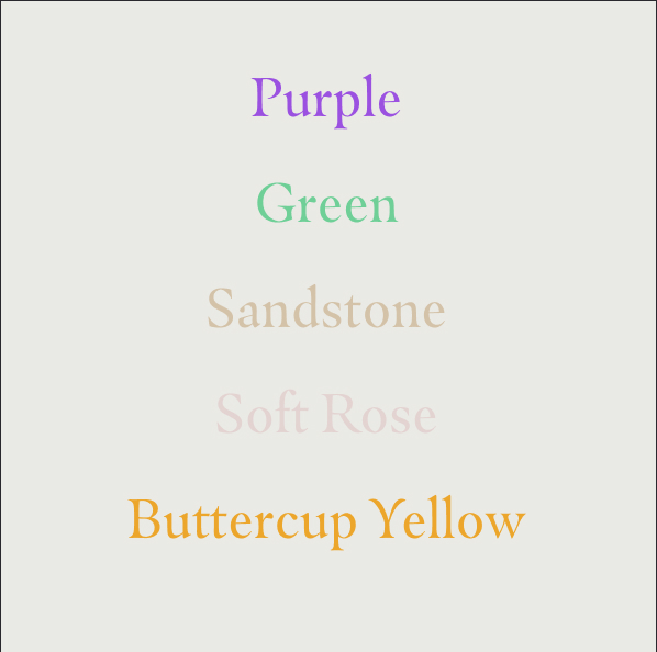
Don’t use coloured type
Don’t make the headline smaller than the body

Don’t use off-brand fonts
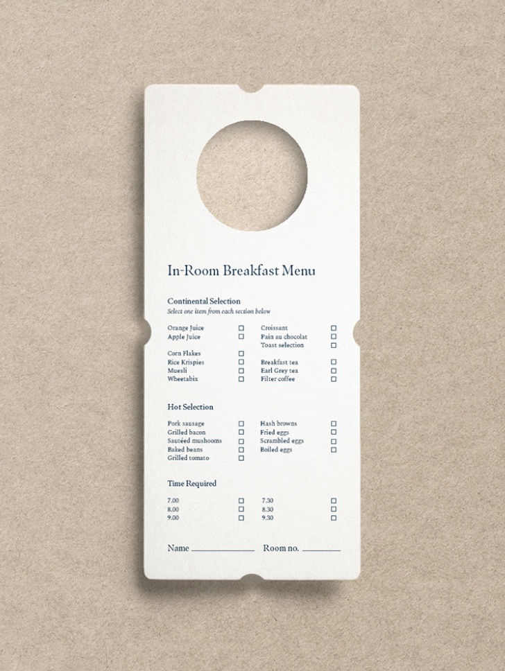
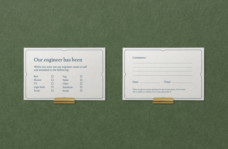
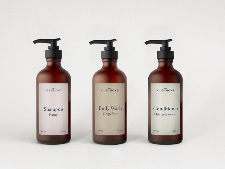
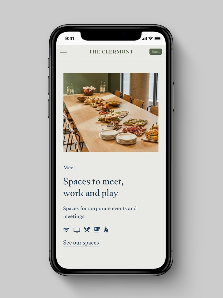
Elegant, warm, timeless and confident. Here are some of our favourite examples of our typography being used correctly, adhering to all of the above rules.
If there is something on this list you are unable to check, get in touch with our brand manager at aline.peters@clermonthotel.group
Ready to go!