
Always aim to create clear structures through the use of grids. Our composition guidelines aim to support consistency across many platforms, environments, and screen sizes, whilst allowing for flexibility in design.
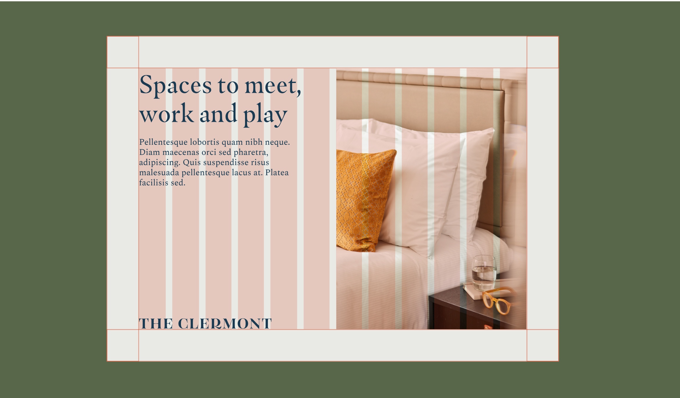
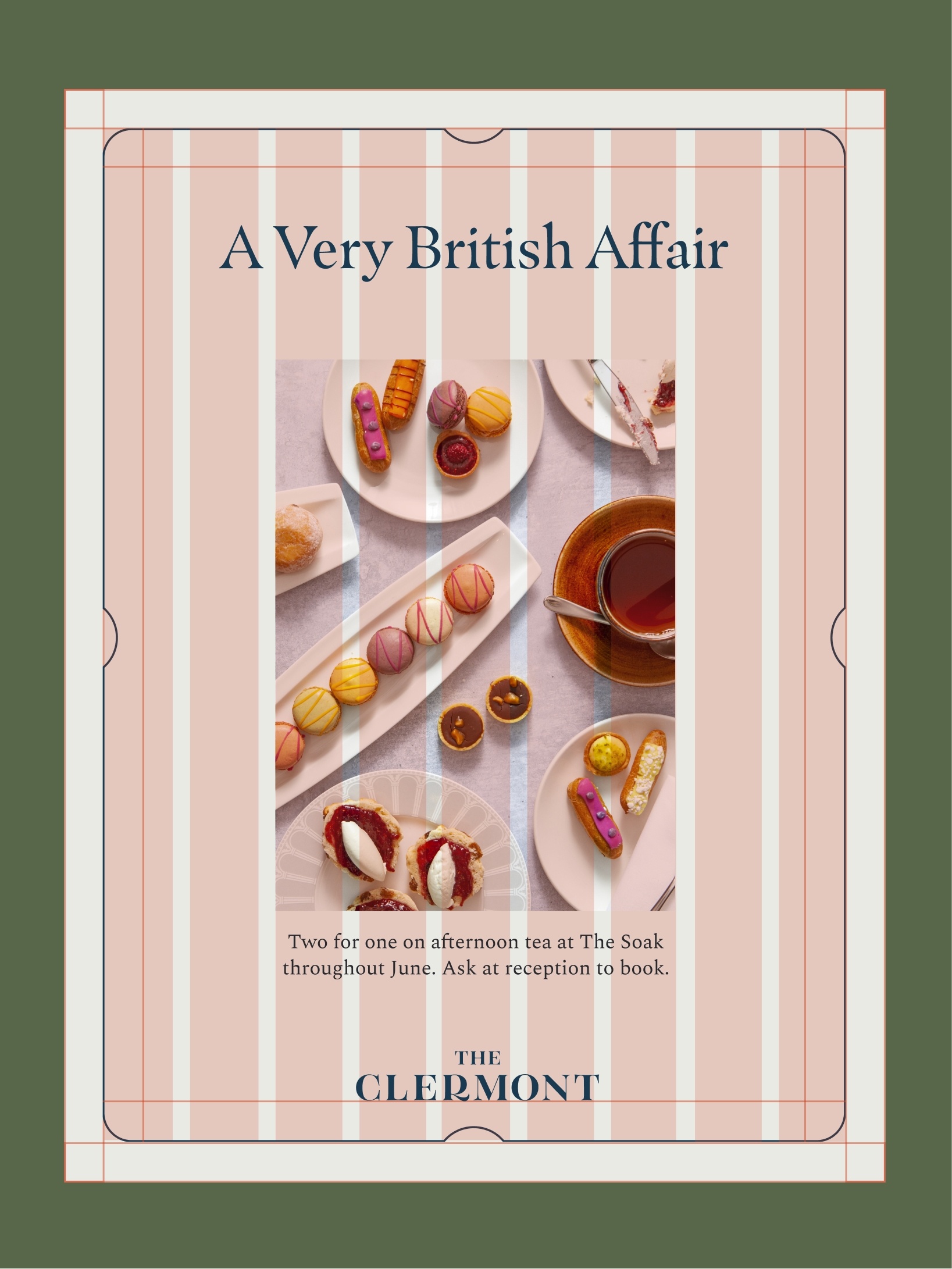
At the beginning of every project, it’s crucial to establish your margins when working with typography. We use the simplest of rules to create margins when including The Clermont frame in your design. And all content should sit within those margins.
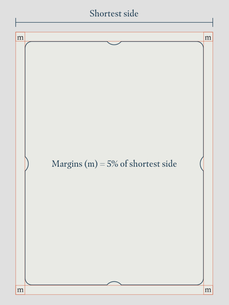
5% margin with frame
Here we have The Clermont frame sitting on top of a 5% margin. We calculate this by taking the shortest side of our asset and working out what 5% is. If the width is 600 pixels wide, the margin would therefore be 30 pixels in from the edges of the page.
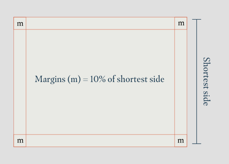
10% margin without frame
For assets where the Clermont frame isn’t being used, we have a larger margin. We calculate this by taking the shortest side of our asset and working out what 10% is. If the width is 600 pixels wide, the margin would therefore be 60 pixels in from the edges of the page.
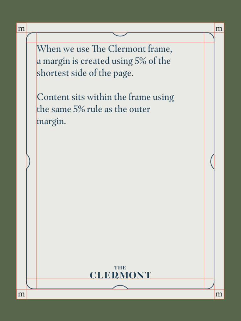
5% margin with content
When applying content within the frame, we use the same 5% rule to create an inner margin for the content to sit within.
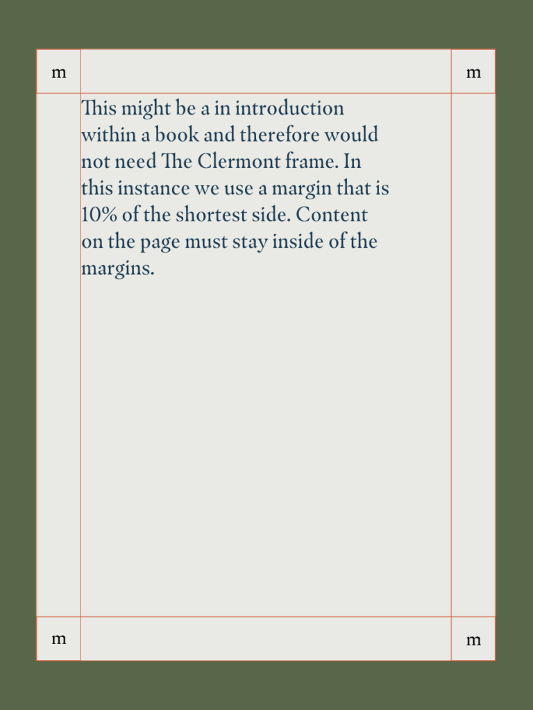
10% margin with content
As you can see in the two examples above, the content margins will always be the same, whether there’s a frame in place or not.
We use columns to create visually balanced and predictable designs that look consistent, regardless of the artwork’s size and aspect ratio. the number of columns depends on the size of the artwork and should be adjusted to meet the needs of your artwork and content.
Using common sense
Depending on the format of your design, columns can be useful to align elements. Be sure to apply common sense when working out how many columns there should be. Columns should always start within the margins
Adapting the number of columns
For narrow or portrait formats, fewer columns are needed, so adapt the number of columns to the dimensions of your asset. Columns should always start within the margins
For websites, it’s recommended to work in multiple of 8s with an 8-point grid system. We can scale margin and padding from this system effectively.
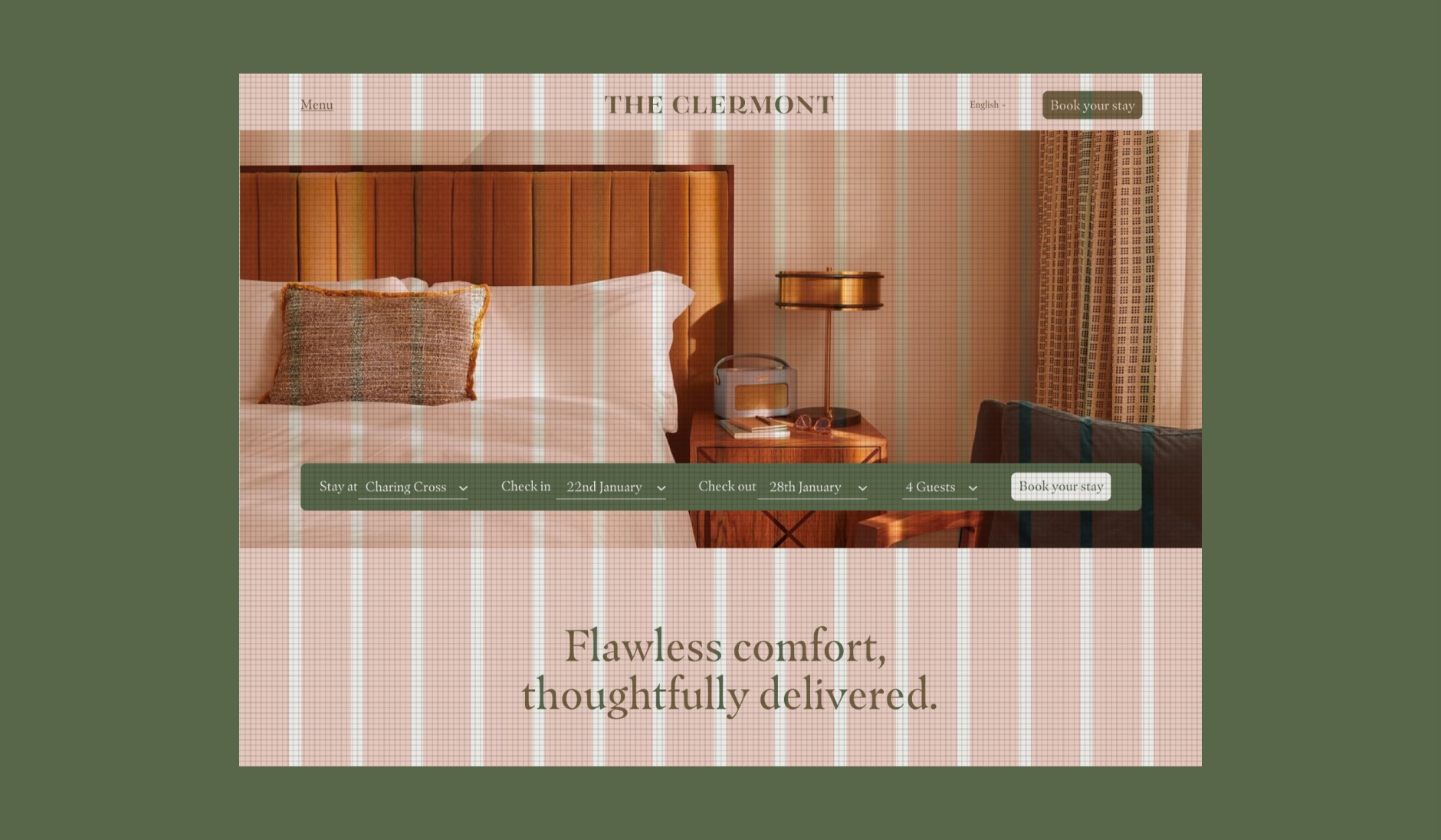
16 Column Layout with 8px grid
If there is something on this list you are unable to check, get in touch with our brand manager at aline.peters@clermonthotel.group
Ready to go!