
Our brand is identifiable through our carefully considered logo, of which there are four variants. In this section we outline the best practices for using the logos, ensuring consistency across all of our brand assets.
Our primary wordmark uses a classical serif typeface that feels established and familiar. The big, open counters feel friendly and approachable and the playful curve on the front leg of the ‘R’ contrasts our horizontal and vertical strokes, adding a human touch to the mark.
Primary wordmark
This is our most commonly used logo variant. We use this when an asset contains any type or image alongside the logo. This logo should never be right or left-aligned – only use centered on the page.
Welcome postcard
Staff handbook
Clearspace
Clearspace is the minimum uninterrupted space surrounding a logo and is important to maximise visibility and impact. It should be adhered to at all times and varies slightly across our four variants.
Primary wordmark clearspace
Clearspace around the primary wordmark is equal to the distance from the top of ‘the’ to the top of ‘clermont’.
Logo Positioning
All logos should be centre aligned, and are to be positioned at either the top or bottom of the composition (following clearspace rules). This placement will depend on the type of communication and its use.
Bottom of the page (portrait)
Top of the page (portrait)
Bottom of the page (landscape)
Top of the page (landscape)
For assets used within the hotel, the logo can sit at the bottom of the page.
This way it is positioned as a sign off to a piece of comms rather than taking the lead.
In general, for external comms, it is often best to lead with the logo.
For example, when receiving an email, a potential customer needs an introduction to the brand before the message is communicated.
An exception to the rule
Often due to a lack of space, there will be times where centre aligning our logos isn’t appropriate. So we left align the secondary logo in these instances.
Compromise with common sense.
An example is our mobile navigation bar. It’s a narrow space which must also contain the menu icon, therefore the solution is to shift our secondary logo to the left.
Minimum Sizes
Our logo needs to be readable at all times. Below we have defined the minimum sizes allowed across print and digital assets.
Minimum size for print
Minimum size for digital
Our secondary wordmark should be used on narrow formats where real estate is limited.
Signage requires impact, but sometimes we have limited space.
On long and narrow signage, our secondary logo is the best fit. It maximises the space we have and increases visibility.
At small sizes, we need to prioritise legibility.
Our logo must always be readable. So when working in small sizes, our secondary wordmark is often the best fit here.
Clearspace
Clearspace is the minimum uninterrupted space surrounding a logo and is important to maximise visibility and impact. It should be adhered to at all times and varies slightly across our four variants.
Secondary wordmark
Clearspace for the secondary wordmark is equal to the cap height.
Minumum Sizes
Our logo needs to be readable at all times. Below we have defined the minimum sizes allowed across print and digital assets.
Minimum size for print
Minimum size for digital
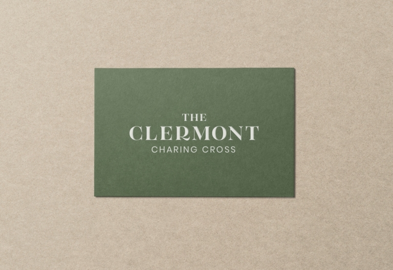
There is an additional logo for each of our venues, which includes the location name below our primary wordmark. These should be applied on assets that relate to a particular venue.
Victoria Wordmark
Charing Cross Wordmark
Clearspace
Clearspace is the minimum uninterrupted space surrounding a logo and is important to maximise visibility and impact. It should be adhered to at all times and varies slightly across our four variants.
Location Wordmark Clearspace
Clearspace around the location wordmark is equal to the distance from the top of ‘the’ to the top of ‘clermont’.
Positioning
All logos should be centre aligned, and are to be positioned at either the top or bottom of the composition (following clearspace rules). This placement will depend on the type of communication and its use.
Bottom of the page (portrait)
Top of the page (portrait)
Bottom of the page (landscape)
Top of the page (landscape)
Minimum Sizes
Our logo needs to be readable at all times. Below we have defined the minimum sizes allowed across print and digital assets.
Minimum size for print
Minimum size for digital
Our supporting mark acts as a visual shorthand for The Clermont brand.
The feather represents the flawless comfort of a Clermont visit. Also, the way a feather floats down, echoes the restful feeling of falling onto a soft bed when arriving in your hotel room.
Staff Pin Badge
We can use the supporting mark in imaginative and playful ways, to subtly reinforce the brand and act as a conversation starter.
Social Media Avatar
The mark should be used where square or circular formats are required, such as social icons and profile pictures.
Clearspace
Clearspace is the minimum uninterrupted space surrounding a logo and is important to maximise visibility and impact. It should be adhered to at all times and varies slightly across our four variants.
Supporting mark Clearspace
Clearspace around the supporting mark can be calculated by using 50% of the height of the mark.
Positioning
When positioning our logos, we aim for clarity and simplicity.
Bottom of the page (portrait)
Bottom of the page (landscape)
Minimum Sizes
Our logo needs to be readable at all times. Below we have defined the minimum sizes allowed across print and digital assets.
Minimum size for print
Minimum size for digital
Common sense prevails when scaling our logo. While it may be tempting to fill all available space, it’s crucial that the logo has enough room to breathe. This gives it a sense of confidence and allows the key message to do the talking.
Do allow the logo to breathe
White space is your friend. It brings balance to the composition. The logo simply needs to be a legible, yet subtle reminder of the brand.
Don’t go bigger than necessary
If the logo is distracting the key message, then you’ve gone too big. Don’t fill the space just for the sake of it.
The format of the logos should never be altered from their original state. Here’s a few examples of what not to do.
Don’t outline the letters
Don’t stretch or compress
Don’t alter the letter spacing
Don’t add drop shadows
Don’t overlay on images
Don’t ignore clearspace rules
Don’t alter the sizes of words
Don’t rotate
Don’t contain within a shape
Don’t ignore sizing rules
Don’t make your own lockup
Don’t allow words to touch
Don’t change the font
Don’t squash the supporting mark
Don’t rotate the supporting mark
Here are a few examples of our logo at its confident and timeless best, adhering to all of our rules above.
If there is something on this list you are unable to check, get in touch with our brand manager at aline.peters@clermonthotel.group
Ready to go!