
Iconography isn’t a substantial part of the brand identity. They’re purpose is to help aid navigation where require. Therefore they should be used sparingly and never as decorative elements.
There will be times where type alone won’t be the most effective way to communicate a message. Icons can step in to break down language barriers and help guide. They can be particlarly helpful in the digital space to aid user experience.
To maintain consistency, we always refer to the Google Material Icons. It’s a library that is constantly growing to ensure every possible requirement is covered. They are designed consistently and succinctly, meaning they’re universally recognisable. And they can be used in desktop publishing as a font, whilst being optimized for digital design.
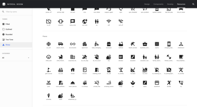
Material Icons Overview
Google Material Icons offer a huge breadth of options, meaning every base is covered
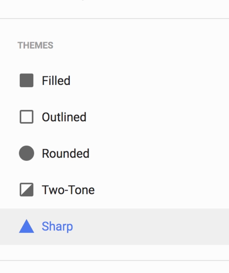
Always select ‘Sharp’ icons under 'Themes'
We always download the icons in the ‘Sharp’ style, as this best complements our other brand elements.
Icon Usage
Icons should never be centre-stage. They are used for practical purposes and should only be used in our brand colours.
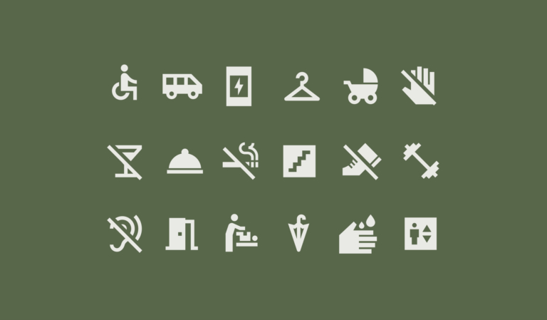
A selection of icons
Here are a selection of some icons that are appropriate to the visual language of hotels.
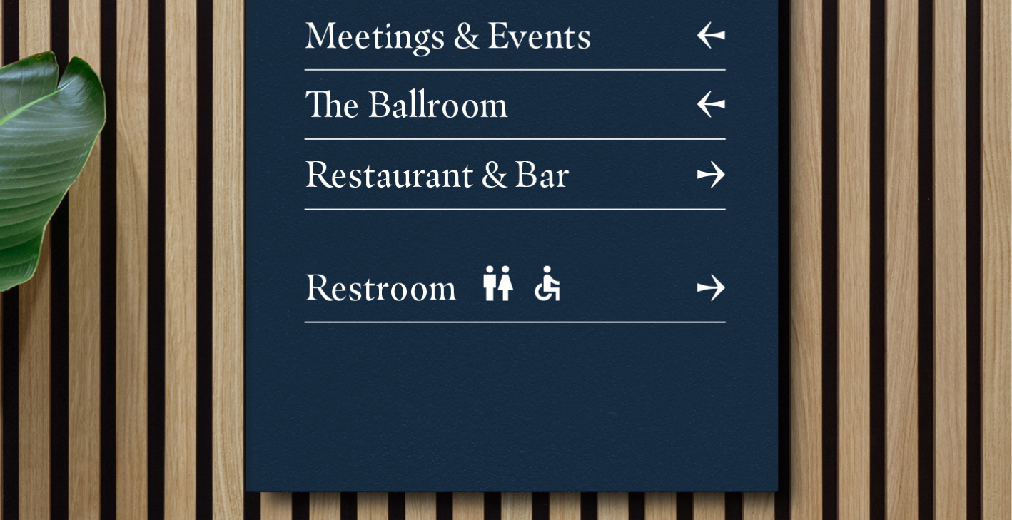
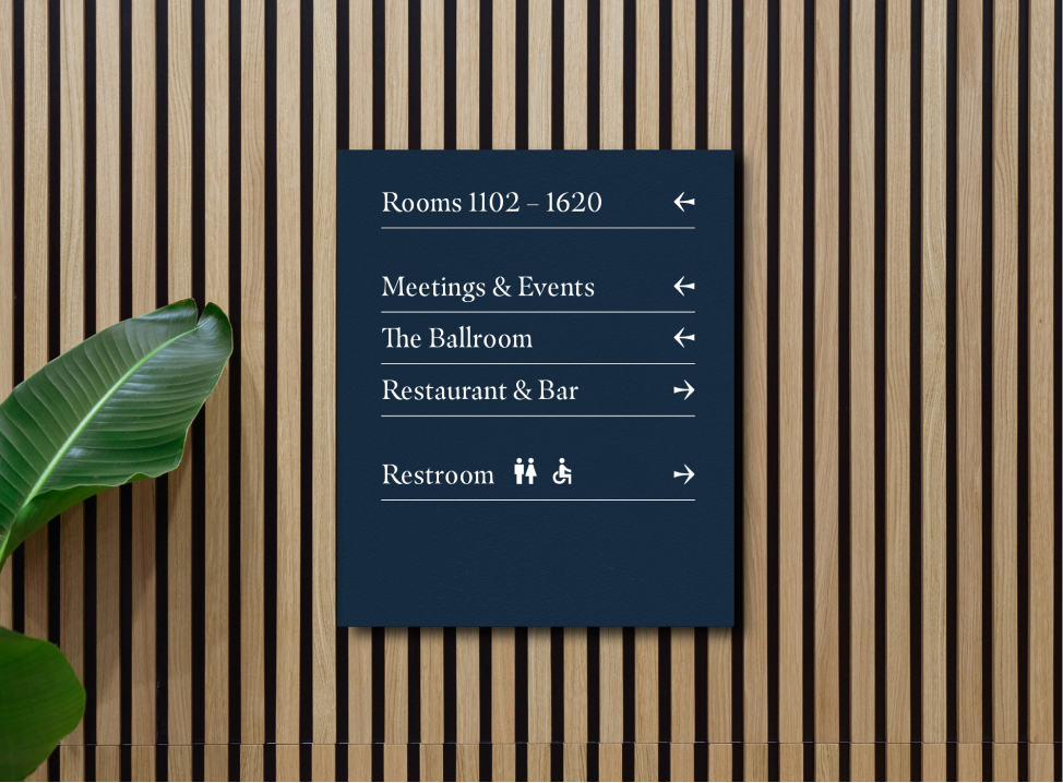
Wayfinding
Important directions can have an icon to accompany the type in order to quickly direct guests.
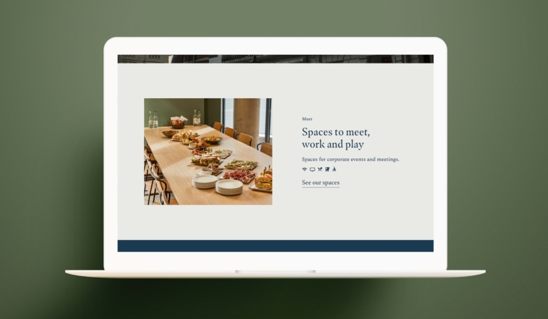
Icons to fast track user experience
Icons in this example are used to provide the user with an instant understanding of the services and amenities.
When used right, icons can be incredibly useful. When misused, they only serve to confuse and distract.
Do use icons sparingly
When the message isn’t instructional, an icon isn’t neccessary.
Don’t use icons as decoration or illustration
Icons should never be the hero of an asset, it shouldn’t replace an illustration or photography.
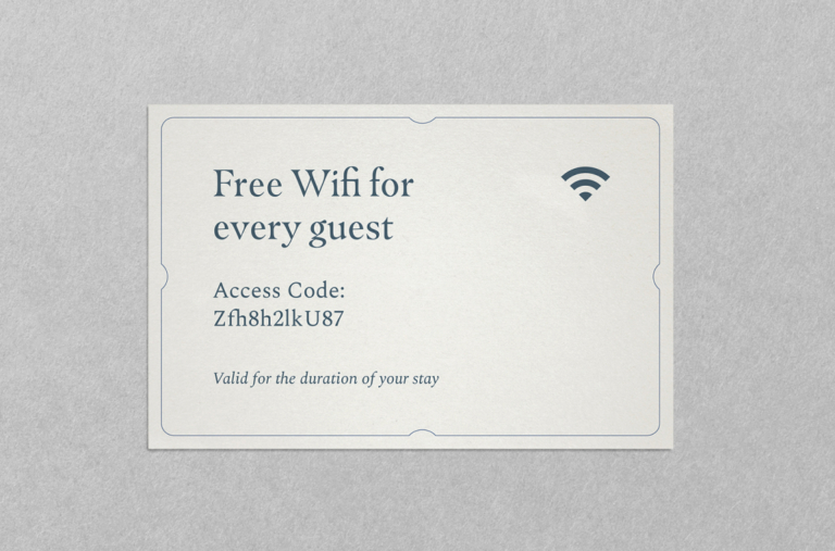
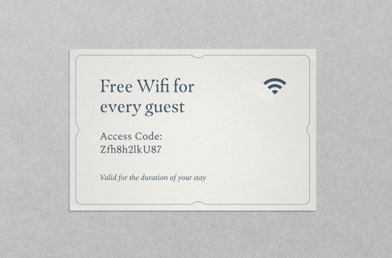
Do use the appropriate icon for the messaging
This example shows icon usage correctly – the wifi symbol is globally recognisable and helps on occasions where there may be a language barrier.
Don’t make your own icons
If you can’t find an icon within Google Material to suit the application, it’s worth asking yourself whether an icon is needed in this instance. For any queries about icons, refer to xxx@theclermont.com
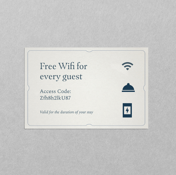
Don’t use too many icons per application

Don’t change or add to the icons

Don’t use multiple sizes when icons are together
Don’t rotate the icons
Don’t mix colours within the icons
Here are some best case examples of when iconography is used correctly
If there is something on this list you are unable to check, get in touch with our brand manager at aline.peters@clermonthotel.group
Ready to go!