
Our website is our biggest sales tool and the digital face of the brand. Beautiful photography, messaging brimming with personality and a seamless user experience. It needs to paint a clear, aspirational picture of what guests and prospective guests can expect from their experience.
The website needs to not only deliver a seamless user experience, but showcase the brand at its very best.
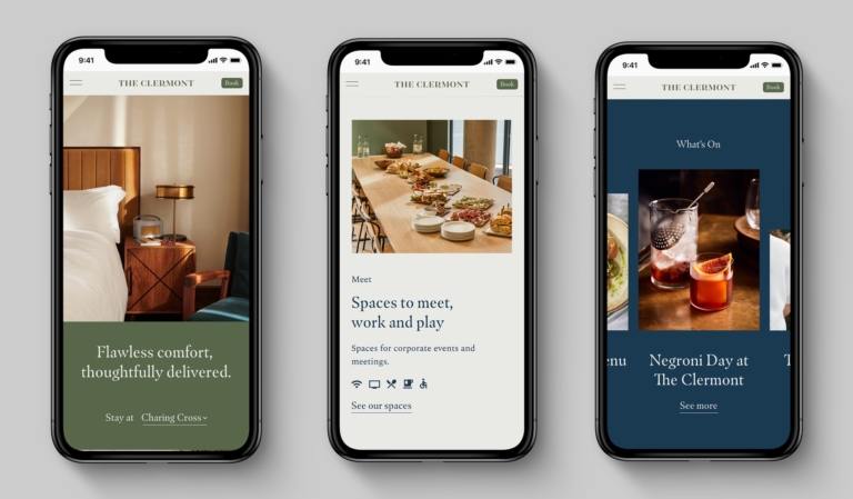
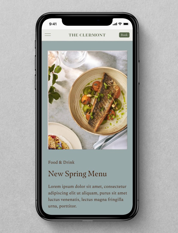
We lead with our mobile-experience
In an increasingly mobile-led world, guests will often start their journey in browsing mode on their mobile devices whilst searching for comparative hotels. Bookings are much more likely to convert on desktop when people have been instilled with confidence.
So therefore how our website works on mobile comes before desktop. Fundamentally it needs to work on mobile – and then adapted for desktop.
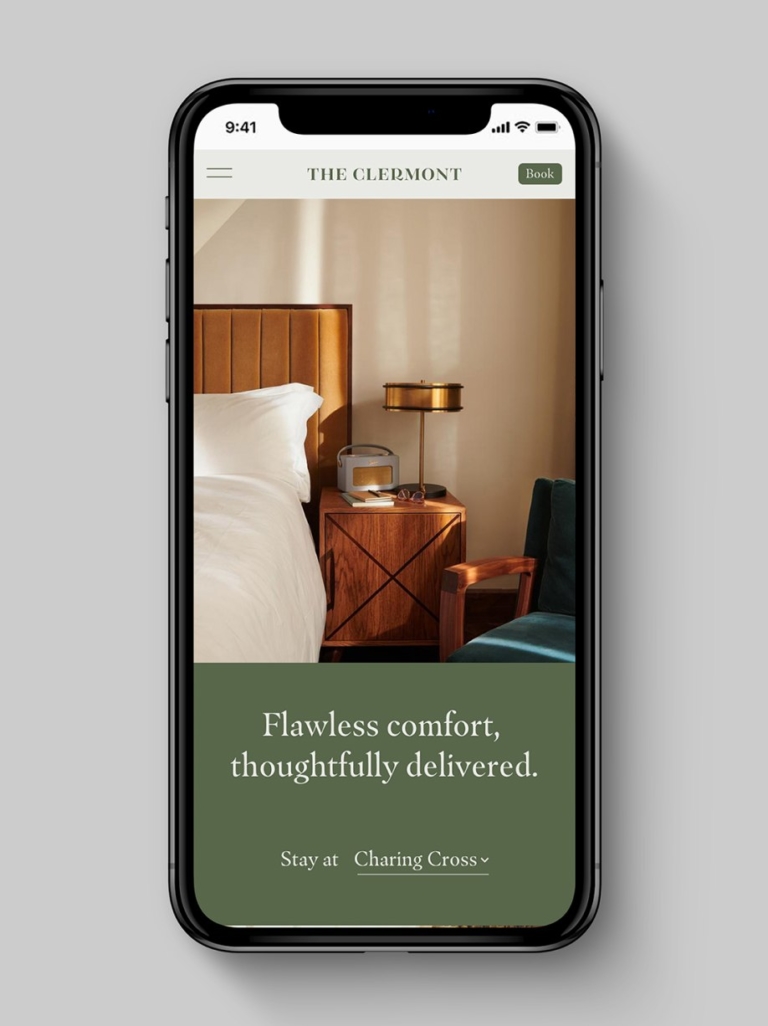
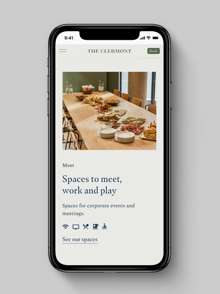
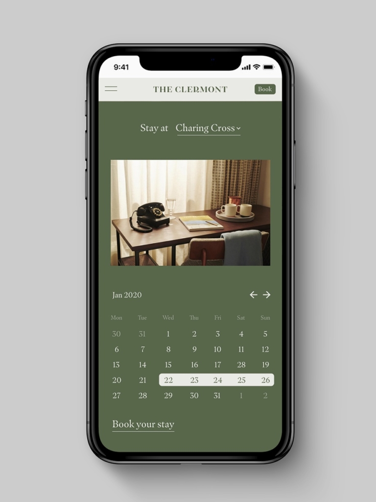
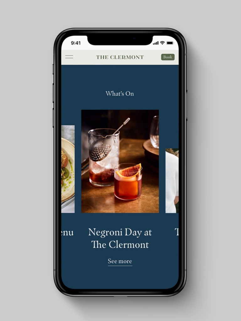
There are a few ways we adopt our brand identity in the digital space. Our buttons, CTAs and iconography are approached with thought and consistency.
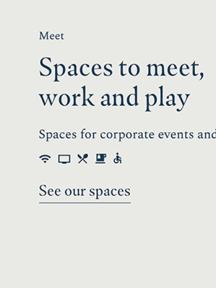
Iconography
We use icons sparingly on our website to aid quick navigation. When needed, we always choose a relevant icon from the Google Materials Library in the ‘sharp’ style. For more information, please refer to our iconography guideline.
Sliders/ Carousels
We always use arrows from the Google Materials Library.
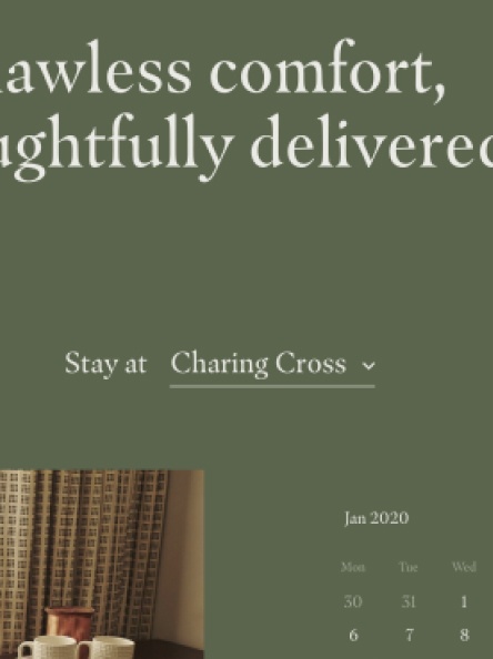
Drop Down Menus
Here we utilise an underline and a simple chevron arrow from the Google Materials’ library.
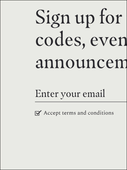
Checkbox
We keep these simple. A box and tick.
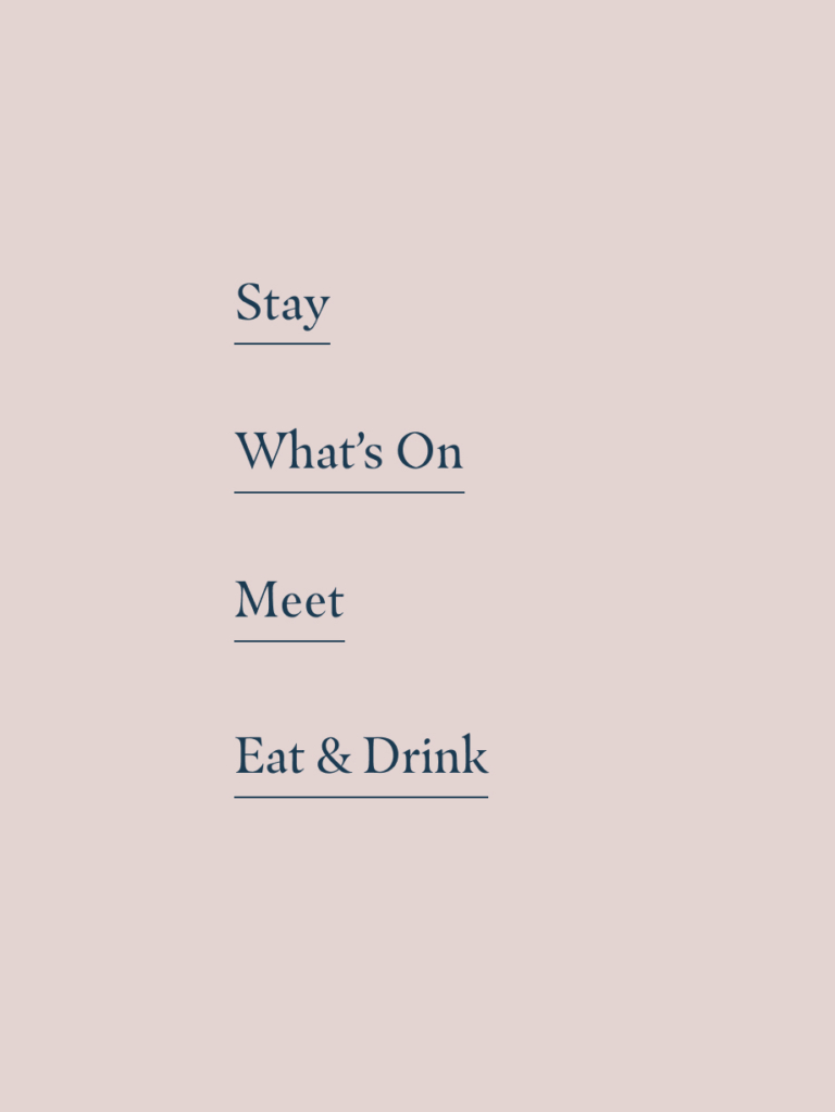
Secondary CTA
The most used CTA style on our website is an underline. This should be used to indicate a button or clickable link.
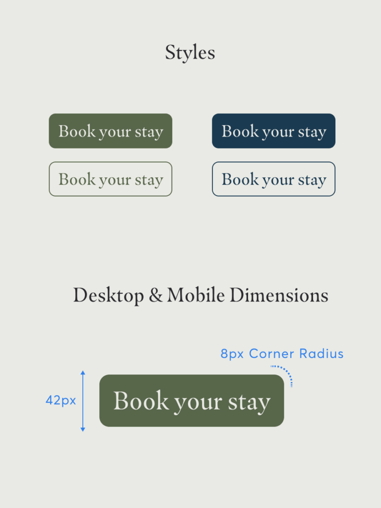
Primary CTA
This CTA style is used to draw attention to key CTAs on the website, such as the ‘book’ button. Buttons in this style should be used sparingly as too many buttons will distract from the user journey.
Throughout the website, it is important to structure type hierarchy to aid navigation and respect low dwell times.
Big, bold photography should help to support our messaging and entice people in. Please refer to the typography and photography sections of our guidelines.
Website Homepage
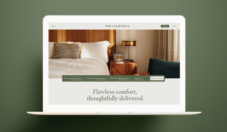
When landing on the site, the user should be met with the best photography we have to show off the hotel. Navigation should never be about indexing the entire site and satisfying every possible journey. Instead, navigation should be stripped back to create a calm, considered experience – in-turn driving conversion.
The booking bar should always be present, no matter which page you are on. On landing, a booking module should be prominent to help the user make quick decisions.
Photography & type module
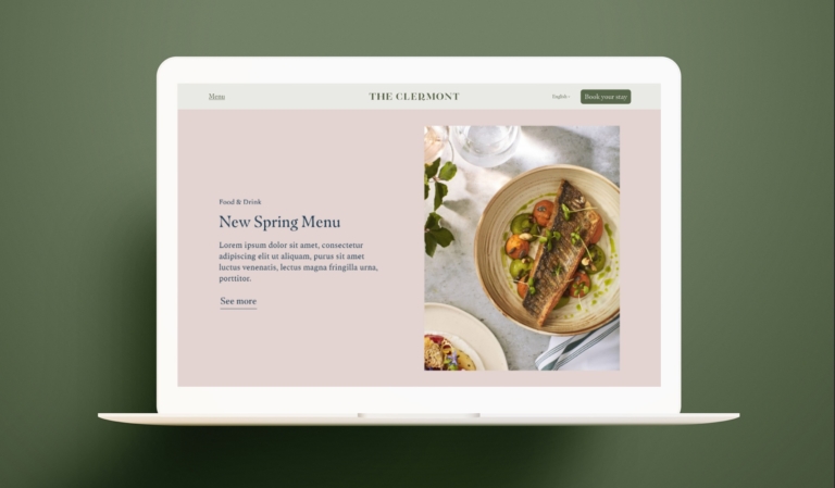
A punchy headline, short supporting body copy and a clear call to action help users to quickly navigate the start of their journey. Big, bold, well executed photography helps us to draw customers in and aids conversion.
Illustration
Illustration should be used sparingly throughout the site to add moments of warmth, wit and charm.
We can break up sections of the website by using a change in background colour or by pulling out type. Our typography section of the guidelines can help when styling type.
Creating hierarchy
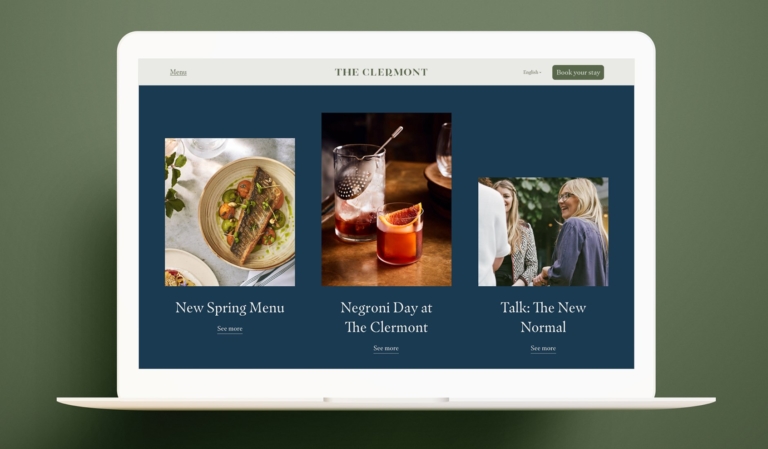
Here’s a best practice example of using type hierarchy in a digital space. There is clear contrast between type sizes which helps define the purpose of each message.
On the website, there will be the main homepage that will be brand-centric. This should look different from our location-specific landing pages. Below are some examples of how the location-specific landing page could look in comparison to the main home page.
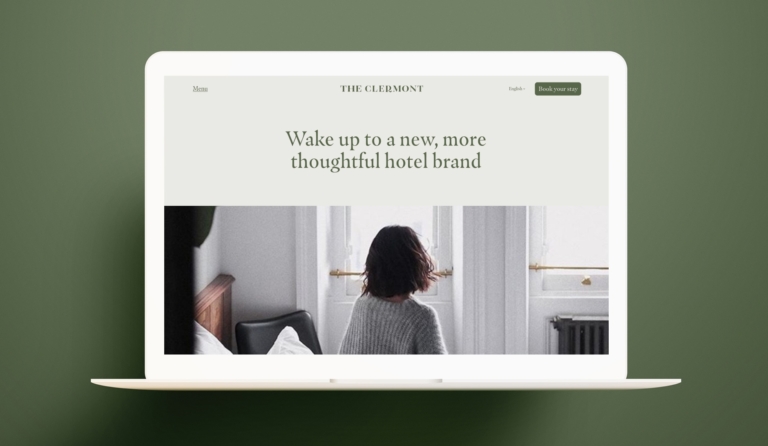
Brand First
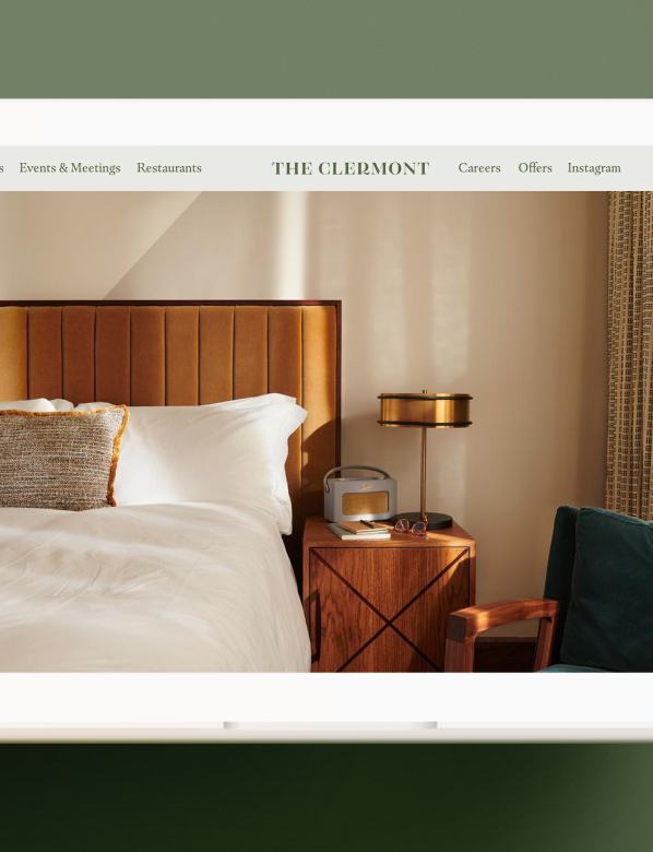
For users who land on the general Clermont home page, they should be met with more lifestyle photography. These users are most likely in ‘Browse mode’ so we ensure the photography is showing the experience more than focussed product shots.
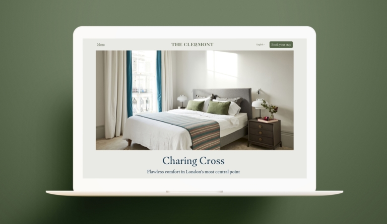
Location Landing Page
If a user has landed on this page, we lead with clear and focussed product shots of the rooms, in order to speed up booking decisions.
There are few places more important to retain brand consistency than the website. Always use the supplied assets and templates where possible. And avoid the following common pitfalls.
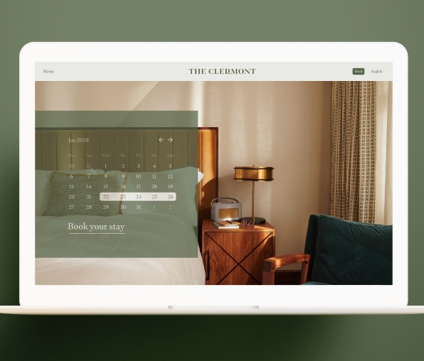
Don't create a confusing or cluttered homepage
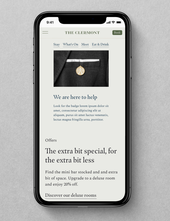
Be consistent with image and type sizing
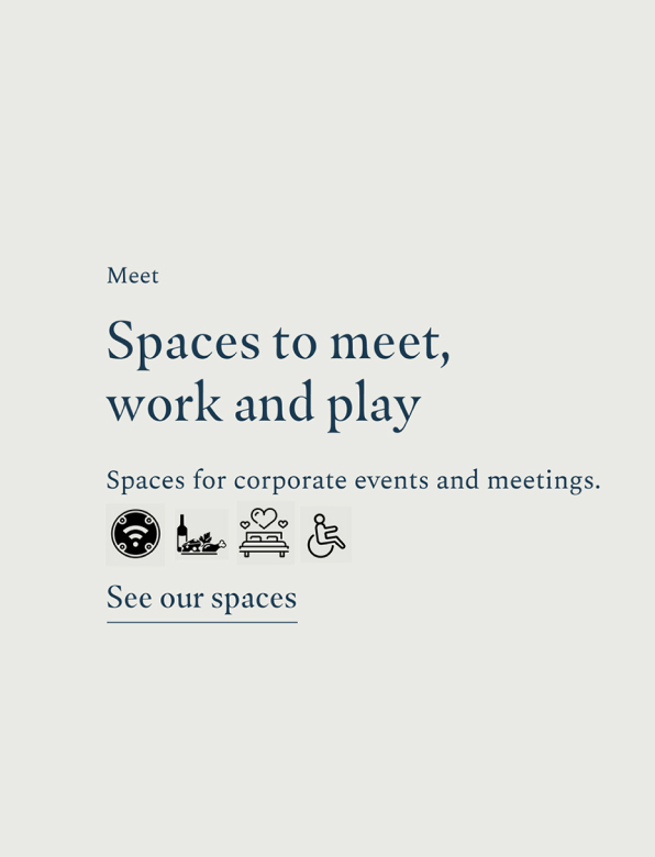
Don't add your own icons that aren't the 'sharp' style from Google Materials
Don't introduce off-brand colours
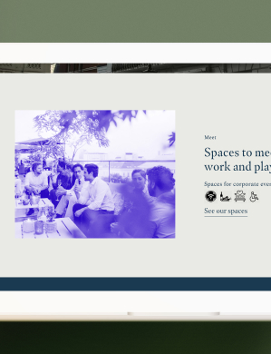
Don't add filters to images
Don't clutter the navigation bar
If there is something on this list you are unable to check, get in touch with our brand manager at xxxxx@glhhotels.com
Ready to go!