
Our signage and wayfinding is functional and easy to understand. Our type helps to ensure our brand personality shines through, but clarity is the core purpose here to ensure guest’s feel thoughtfully guided throughout their stay.
This is not purely a challenge of aesthetics. We need to also consider materiality of the sign to ensure durability.
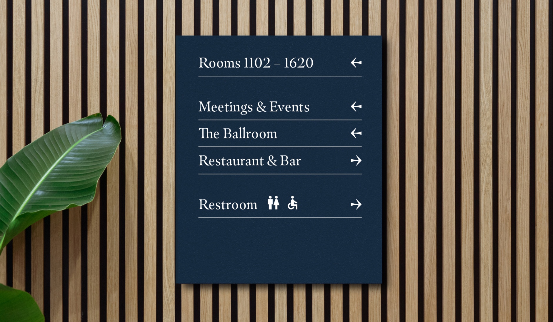
Wayfinding Board
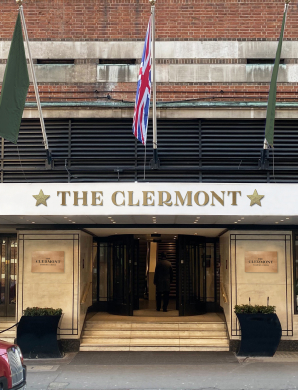
Our front signage needs to be clear and clean. This is the first impression of the hotel, so high quality materiality is a must, as is signage that’s easy to clean.
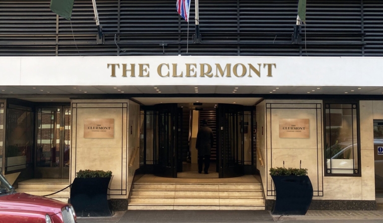
Fascia Signage
Logos used on the front of the hotel should be large enough to be seen from a distance. But should also respect the clearspace rules.
We have a specific system designed for our internal wayfinding to ensure it remains consistent throughout our properties and across our portfolio. Please follow the rules set out below carefully when producing any internal signage for The Clermont.
Best Practice
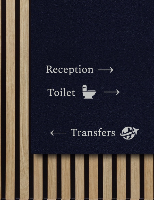
This is the best practice for a wayfinding board. We always align our info to the top left and shouldn’t be afraid to leave space at the bottom. This gives the directions a bit of space to breathe and be seen clearly.
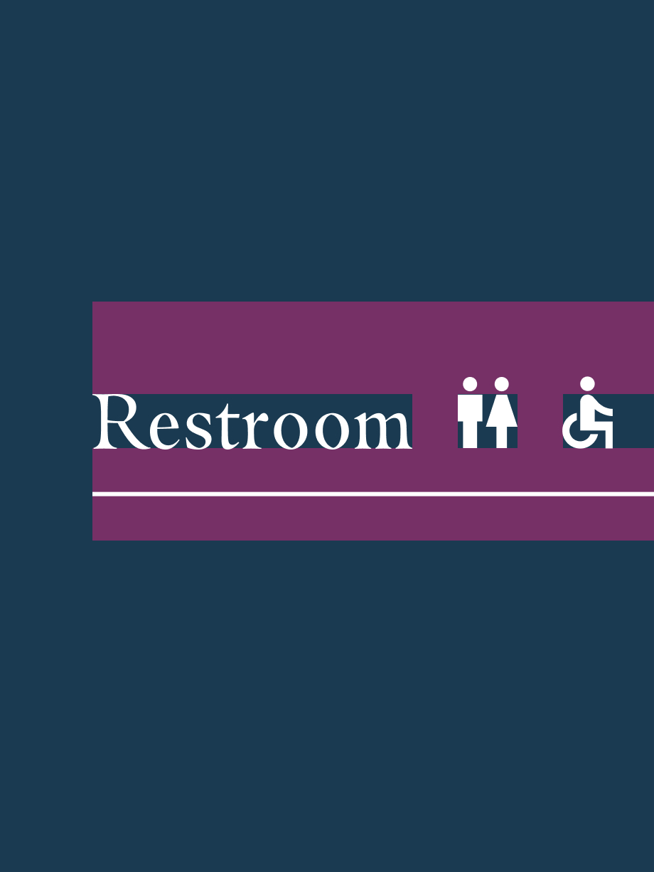
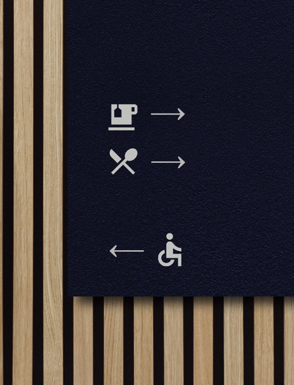
Arrows and icons are used to help direct people, but only use icons for important directions such as toilets or exits. You can get these icons from the Google Materials library. There’s more on this below.
We always use our Royal Blue as a background and white for the type. This is to make sure there is ample contrast which ensures the wayfinding is clear and legible.
Royal Blue
Our Royal Blue is always used as a background for our signage.
CMYK: 94 69 43 41
RGB: 26 58 81
HEX: #1A3A51
PMS: Pantone 541 UP
RAL: Sapphire Blue 5003
White
White is used for all type, arrows, lines, and icons on our signage. This is for contrast and legibility.
CMYK: 0 0 0 0
RGB: 255 255 255
HEX: #ffffff
RAL: Pure White 9010
When using arrows and icons on wayfinding, make sure the sizing is always consistent. We use icons from the Google Materials Library. Our arrow is a custom-made arrow that fits with our hero typeface, Masqualero. This arrow is supplied in the wayfinding pack at the top of the page.
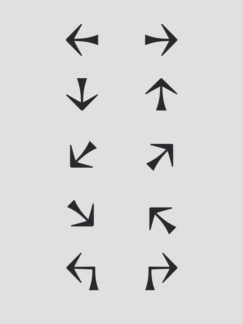
Our Custom Arrows
These are our custom made arrows. They can be used in the above orientations. We size this as the same height as the type it sits next to. Please don’t use any other arrow styles.
Sizing Google Icons
Common sense should be applied when sizing icons. Use the line height as a guide – although, in some instances, this will make the icons too small. An example would be the people icons – we’ve aligned them to the shoulders as sizing the icons down to fit in the line height made them too small compared to the type.
When setting up artwork for signage or wayfinding, we follow the same rules as the Composition page. The margins should be 10% of the shortest side.
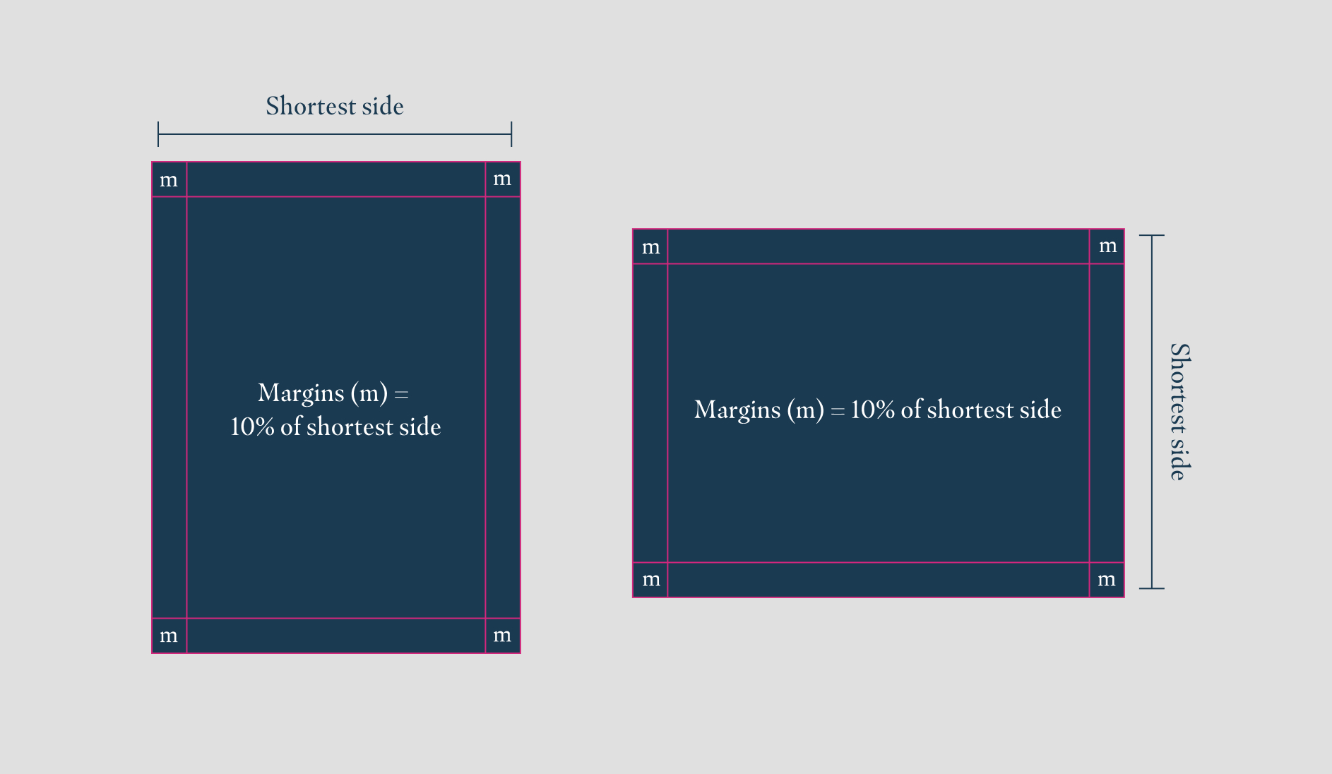
10% Margin
We calculate this by taking the shortest side of our sign and working out what 10% is. If the width is 600mm wide, the margin would therefore be 60mm in from the edges of the sign.
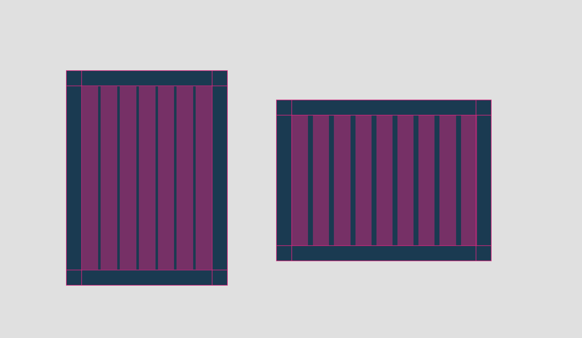
Columns
Columns can be useful to align elements. Columns should always start within the margins and should be the same width as the margins. The gutter (space between columns) can be flexible as you try to comfortably fit columns within the margins.
We primarily use our hero typeface, Masqualero Regular, for most of the signage. When type size becomes too small, we switch to our supporting typeface, Spectral Regular.
You will need an Adobe Creative Cloud account to download/activate Masqualero Regular. Spectral Regular can be downloaded from Google Fonts.
There are three main type sizes we use on our wayfinding. Lines at a 4pt weight are used to increase the legibility of the direction. Arrows are sized at the same cap height as the corresponding type size used.
Occasionally a larger type size is needed. These are seen as anomalies and are outlined below.
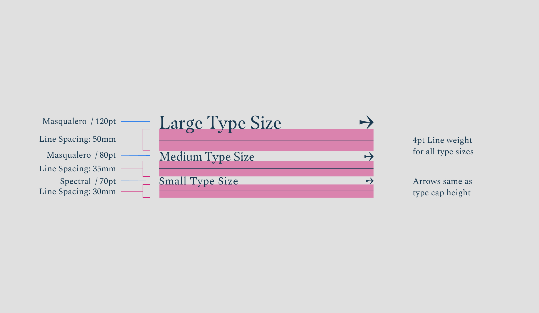
Type Sizes
When using these type sizes, there are predefined spaces and arrow sizes. Please always use the correct corresponding arrow/spacing. When the type gets too small, we switch to using Spectral, as this increases legibility.
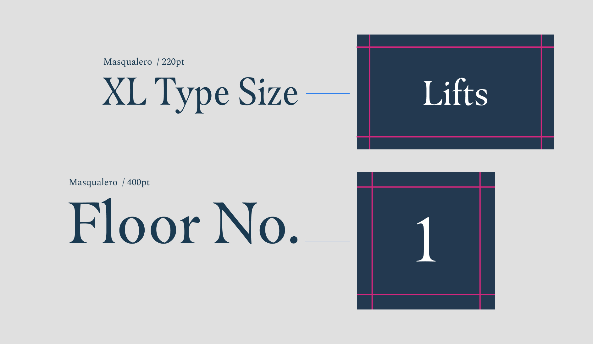
Extra Large Type & Floor Numbers
These extra-large type sizes are used specifically for floor numbers and as signs for the lifts.
The order of the items on our wayfinding is really important. We need a system that customers can become accustomed to as they move around the hotel. Below is how the information should be structured.
Wayfinding Categories
- Bedrooms are always first
- Meetings & Events Spaces (sorted alphabetically), Restaurant & Bars
- Communal spaces e.g. Reception, Restroom & Lifts (Restroom is always last)
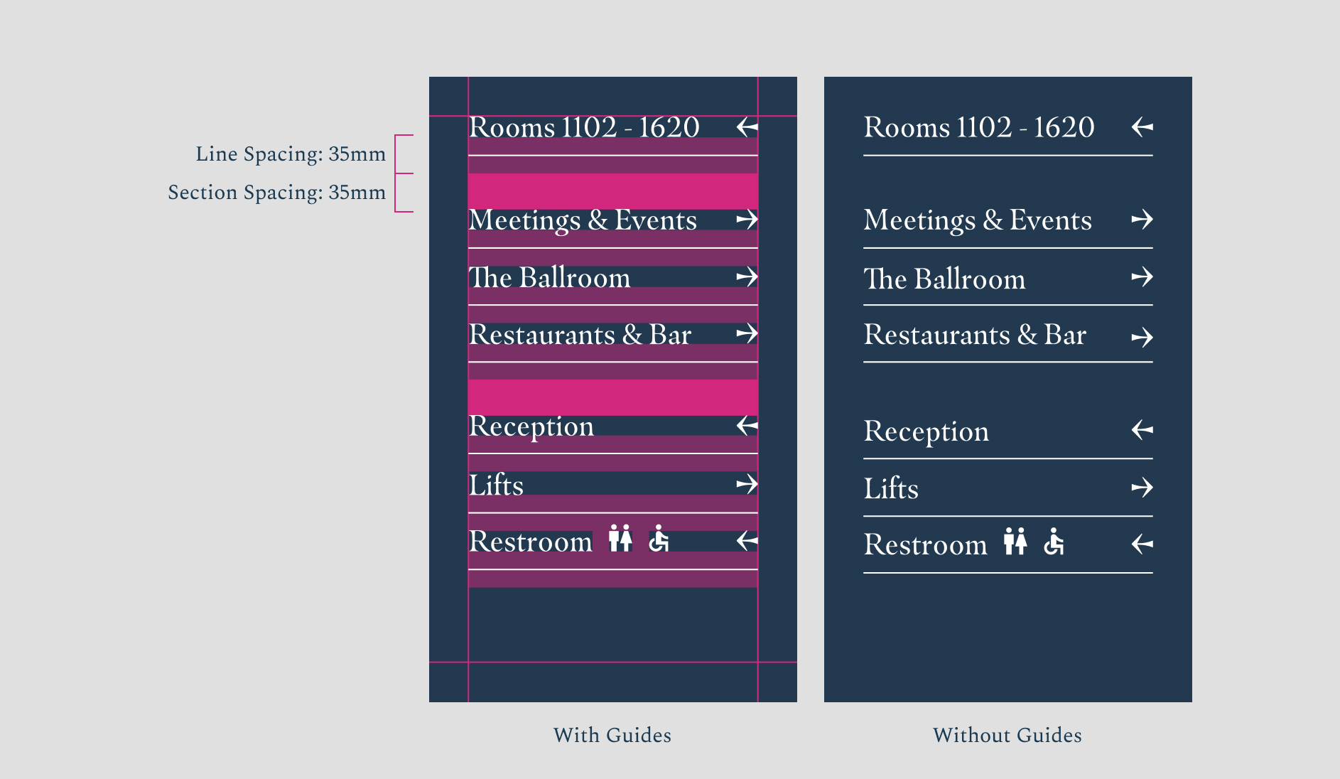
Spacing the Categories
This is the best practice for ordering information. A gap is always applied between category sections. This should be the same height as the line spacing.
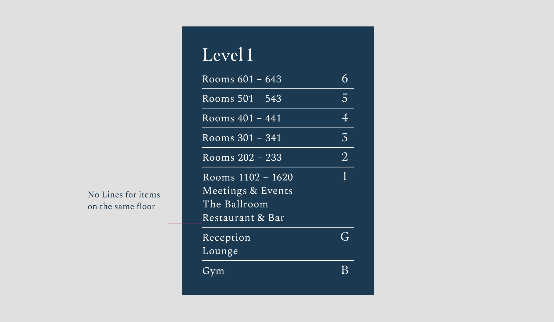
Floor Level Boards
On boards that are detailing different floors, lines shouldn’t be used for items on the same floor.
Our room numbers are approached differently, these sit in a system of their own and the materiality is more elevated.
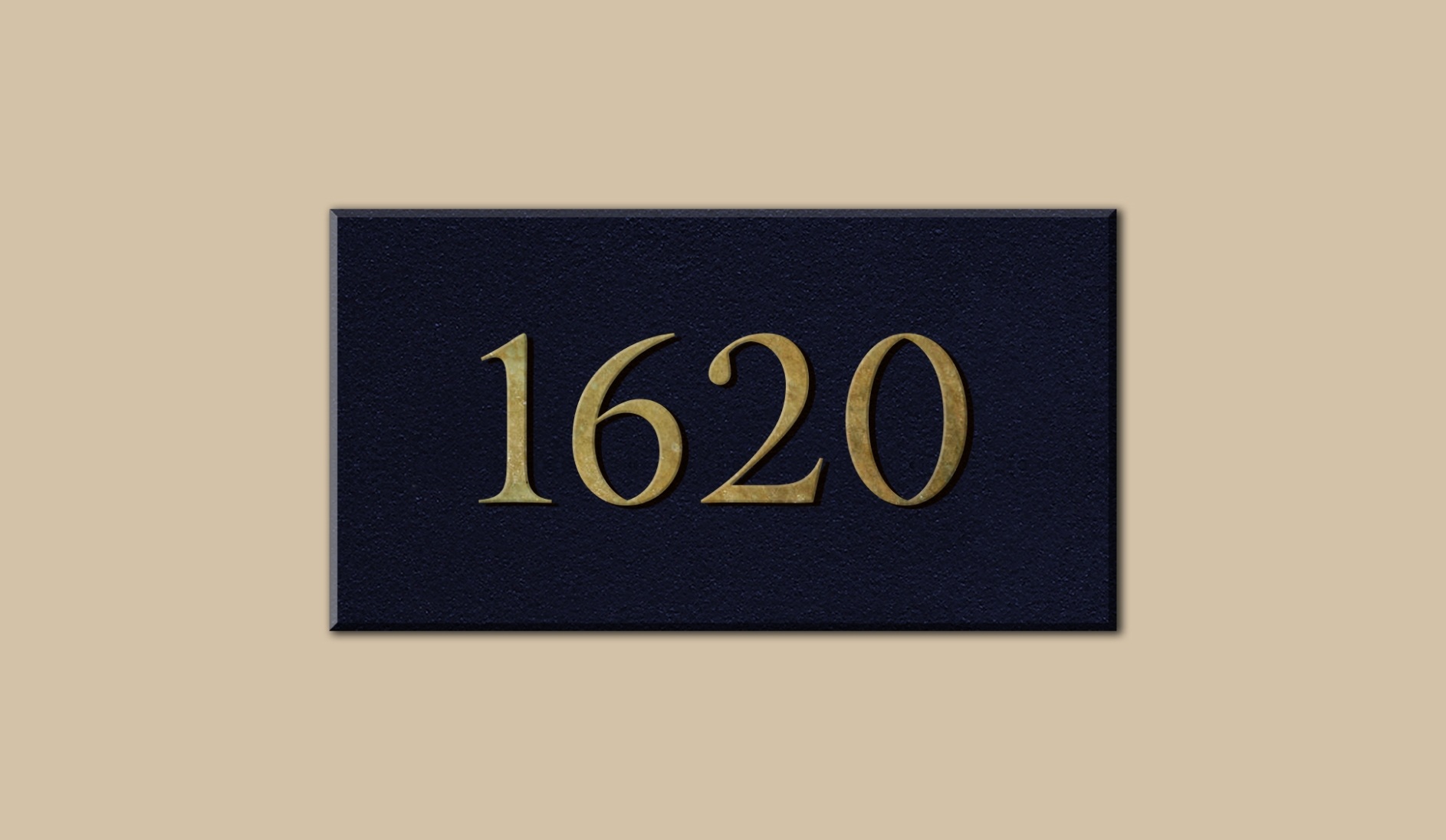
Numbers = 45mm height
Our room numbers should all be consistent with a 45mm Height. We use a brass metal instead of the white type, to make the rooms feel more elevated.
Here are some classic signage and wayfinding errors. Avoid them at all costs.
Don’t use the primary logo when it needs to be visible from a distance
Don’t add icons to signage
Don’t use icons that haven’t come from Google Materials' library in the sharp style
Don’t use icons alone if it is unclear what they could mean
Don’t pixelate content on screens
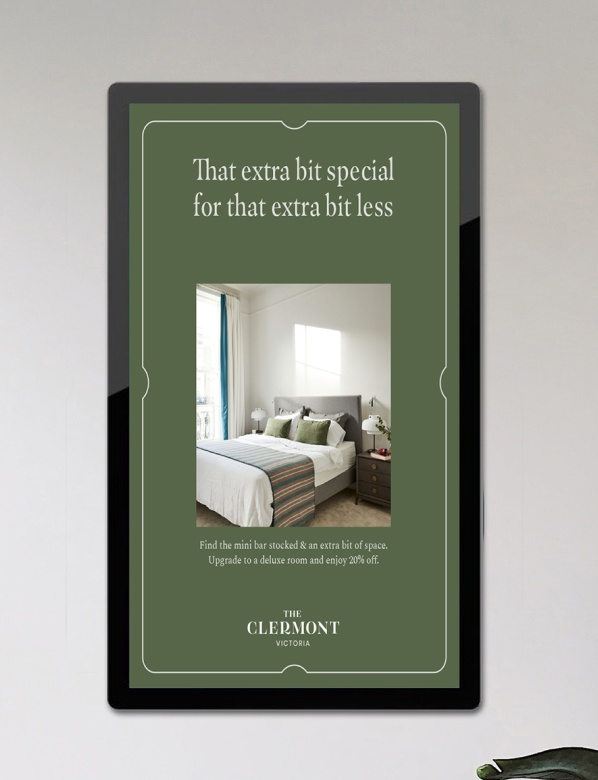
Don’t squash content to fit the dimensions of the advertising board
If there is something on this list you are unable to check, get in touch with our brand manager at xxxxx@glhhotels.com
Ready to go!